I’ve often wondered how to convey designs best to developers (and potentially other stakeholders) when there are multiple states to a design. For example a form field could have an inactive state, an hover state, an active state and so on. Or an accordion could be open or closed.
It often seems that there is an either or in using tools to convey these details in design. When you deliver a page or screen design in flat 2D, developers can easily inspect the elements using tools such as Invision, Abstract, Marvel, Zeplin etc. These tools help the developer figure out the exact dimensions and styles, but they won’t help much in understanding how an element should transition from one state to another. Similarly, there are plenty of animation tools on the maret such as Flinto, Principle, Kite and Drama but none of these allow for detailed inspection.
On top of that, a component such as a searchbox that has been designed as a symbol inside a UI library, has (currently) no way of conveying different states.
To address all of these issues, I’ve started creating design boards that show on one page all possible states more or less like a blueprint or a plan. The first project where I started to apply this technique was for Fair Photo. See the first design board below:
When I started designing components inside the Gelato design system, I wanted to include the ability to swap between different themes (as I had laid out in the Gelato design system blog post part 2.2). Then there could be one master component, styled as a wireframe or low fidelity, on which the themed versions are based. This way the designer only ever needs to design the structure once.
In that case, a final component design would be delivered on a flat 2D plane that starts with a low fidelity/wireframe version, followed by all the different themed versions. The developers and other stakeholders could first see in detail how the component is structured in the wireframe and view the high fidelity versions right next to it.
After incorporating different themes in the same UI library file, I learned that doing so significantly slowed down my RAM to a point that it was about to blow up. Read more about this in detail here. A much better way to achieve this is through using plugins such as Camilo.
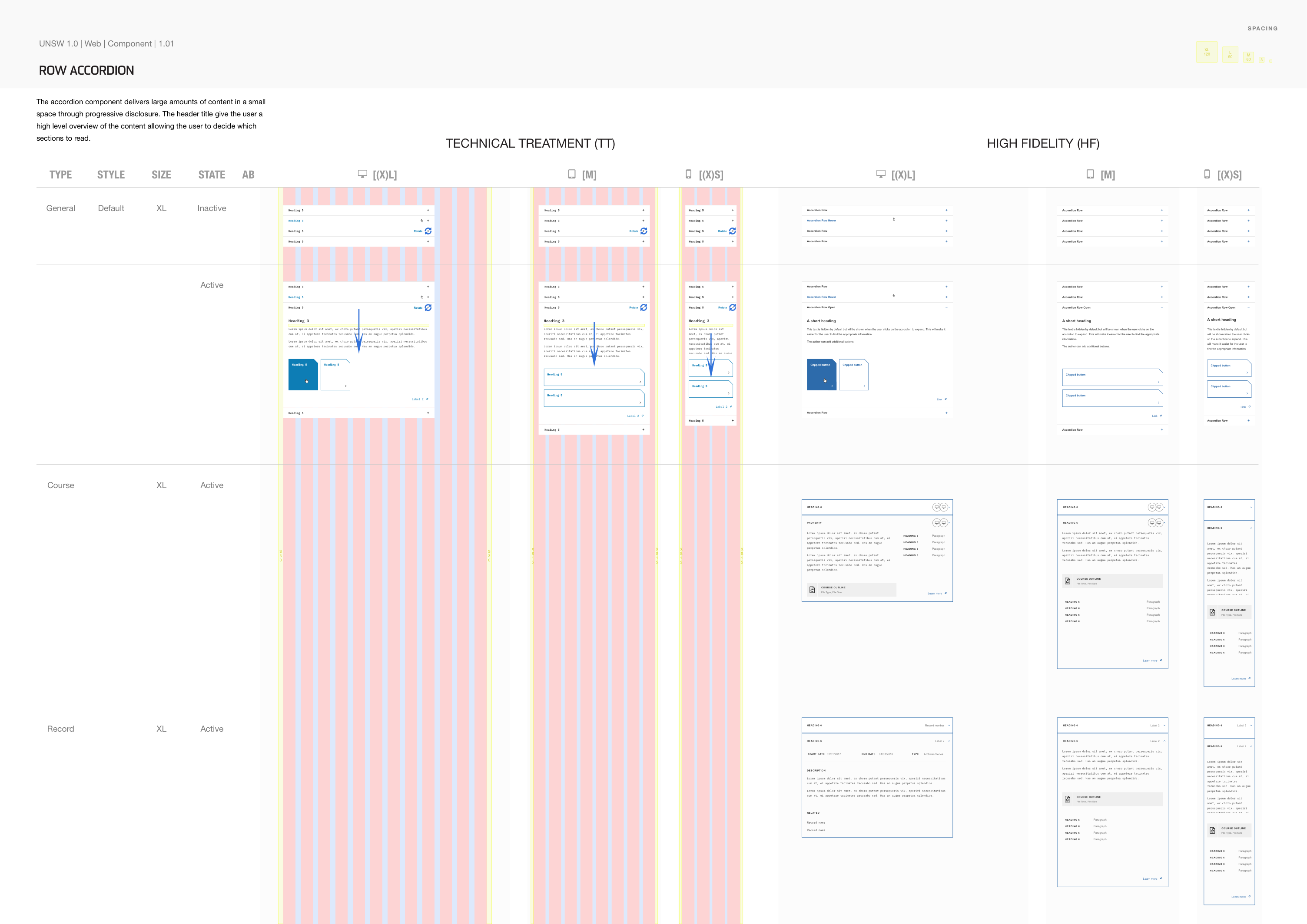
While wireframe versions of components are great for fast prototyping and user testing, I realised that they could also be used to convey technical information to describe precise dimensions and behaviour. In contrary to high fidelity designs, it doesn’t matter if wireframes are permanently covered in scribbled annotations to display measurements and transitions on the design boards.
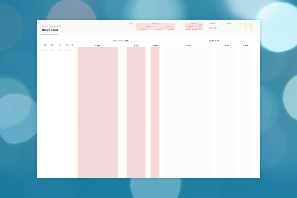
So the next iteration of the design board design was divided in roughly two sections, a technical treatment (TT) version and a high fidelity version (HF). In addition, it is very handy to instantly see how the designs would behave on other devices. Therefore 3 designs (or however many breakpoints your product has) are placed on the board for both the TT and the HF columns, and if need to be, the HF column could be extended to display more themes.
Finally, to ensure that these could be nicely printed, each of the design boards are kept at an A4 (1.41) aspect ratio.
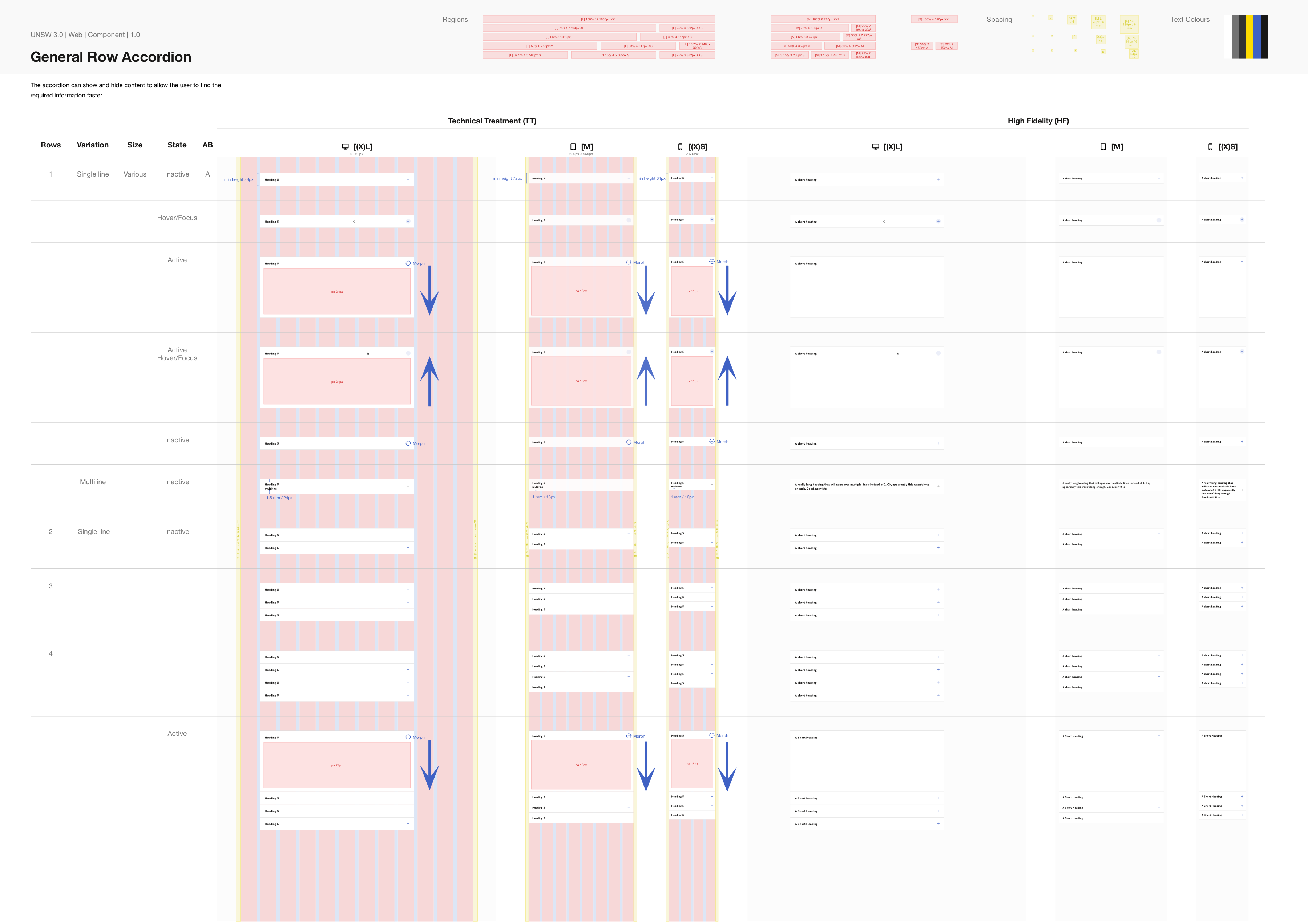
With the arrival of a new gusti (Gelato design system version, read more about it in Gelato), UNSW 3.0, the layout had changed. The max width on desktop had shifted from 1170px to 1600px and the inner columns and gutters shared no longer the same width. Also spacing sizes had changed. However, we still had to support some websites that were using UNSW2.1, so the old layout had to continue to be supported by design too.
So I had to create a design board that could swap out the layouts and spacings at will. To help with designing for the right layout, I added layout and spacing legends to the top (and later also text colours).
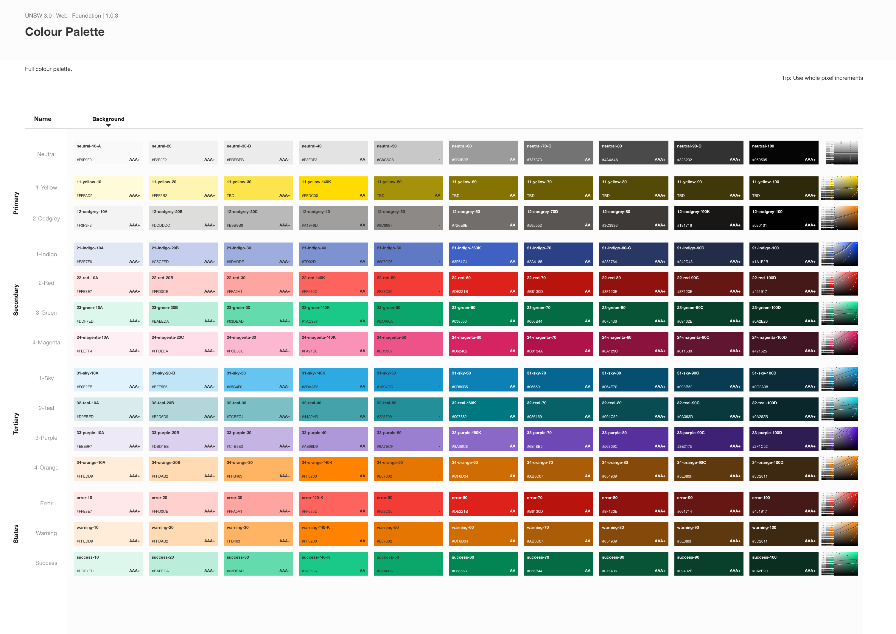
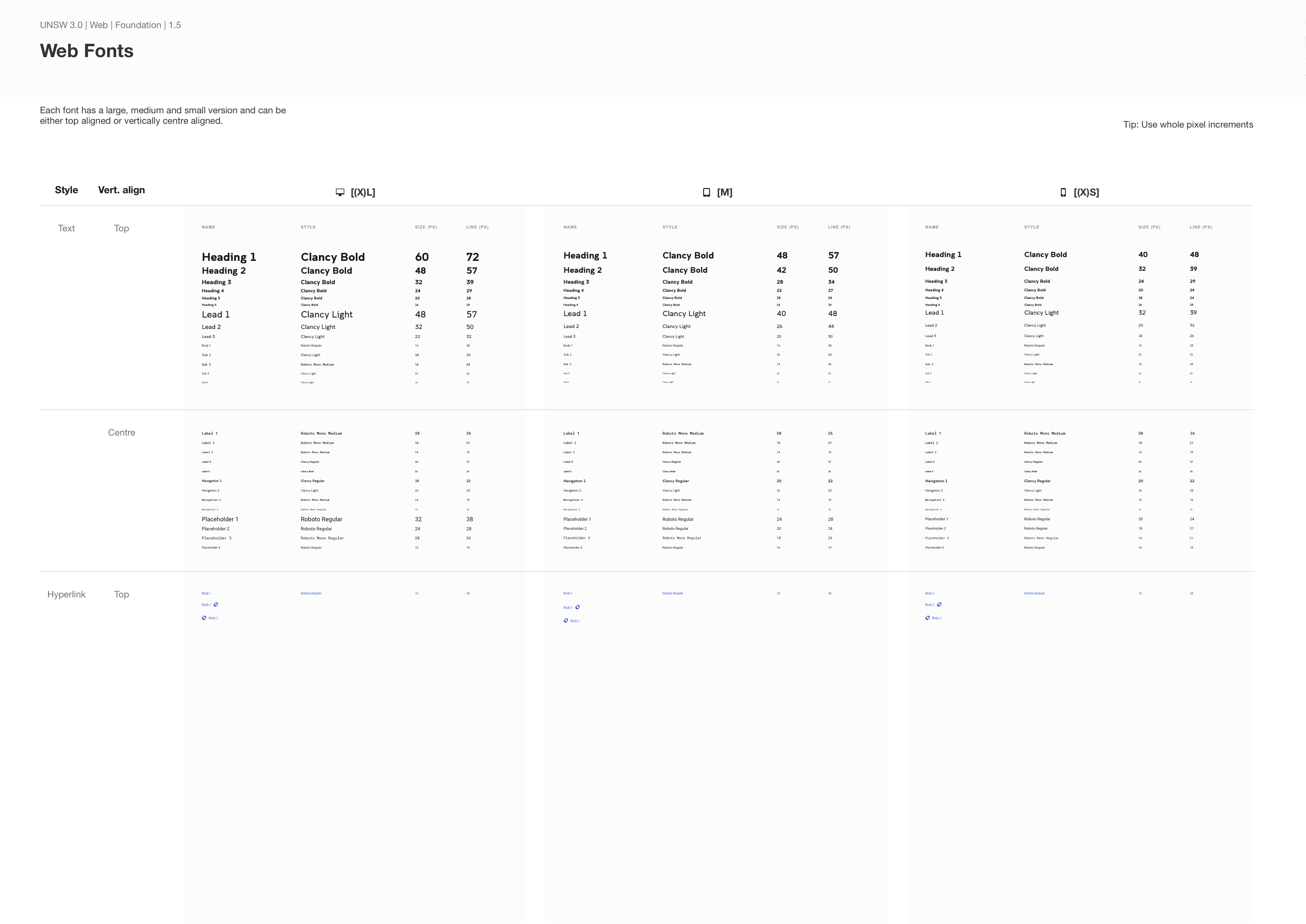
Then I realised that the layouts doesn’t necessarily need to be layouts for components. I could create layouts for colours, fonts etc. as well. See below.
Because design boards can be used for any project, they belong in the Supportive Design System within Gelato. Read more about this in the Gelato project.
Within the supportive design system, the actual design board sits in a library file called “components_vetrina” and the different layouts can be called from the “organisms_vetrina” library. See the organisms that we’ve created so far below.
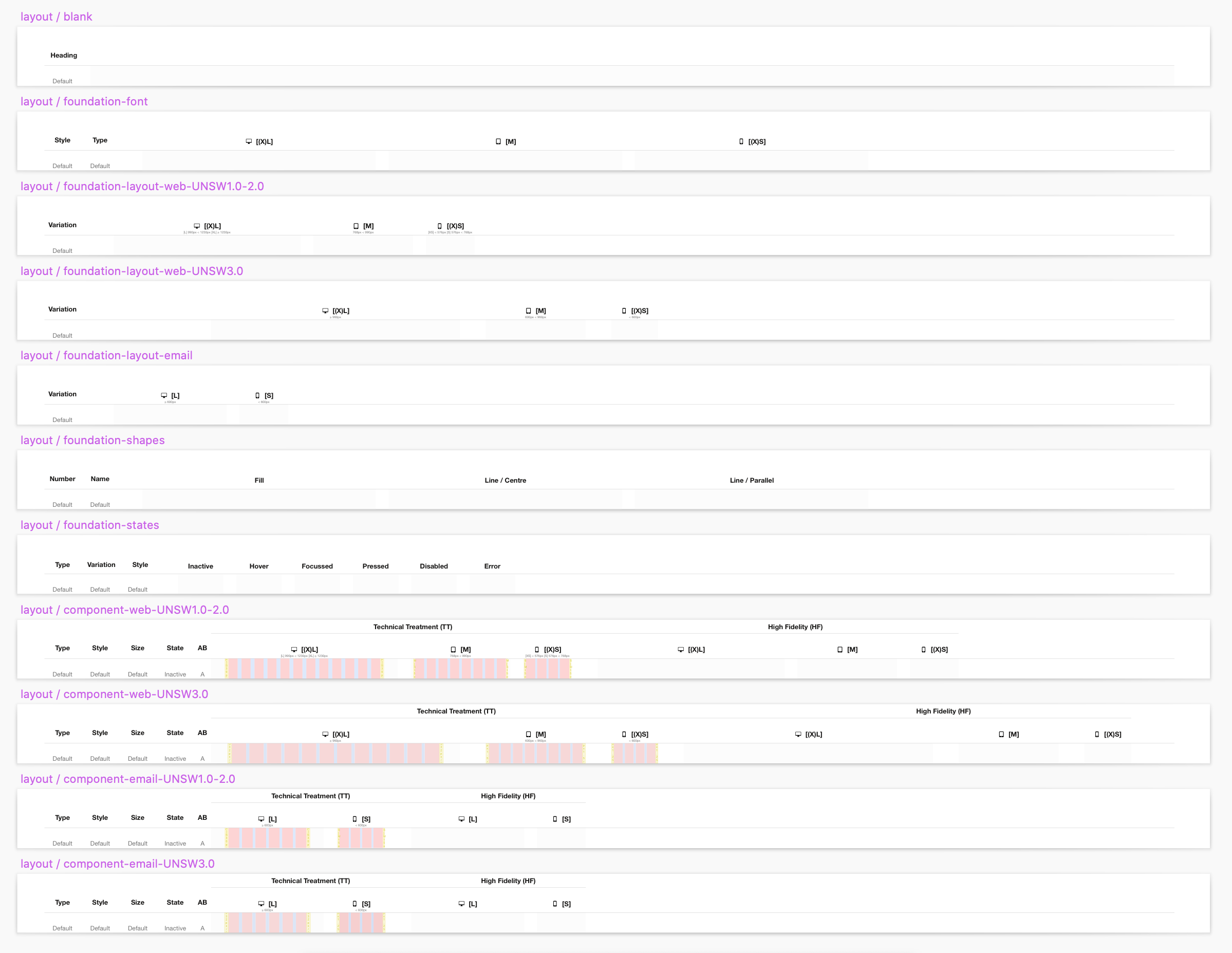
So by treating a design board as a symbol inside its own supportive design system, it is possible to make it cater for near any design artefact that needs to be presented.
Only at a later stage I decided to treat page templates the same way as I treated components and component templates. This meant that these too would be placed on design boards and get their own wiki page to track changes and approvals. This meant that I could include more information on screen sizes so that I could instantly see how much of the website could be visible at any instance (roughly, as some screen sizes would stretch the page horizontally too).

And that leads us to the final iteration of the design board.


One Comment