Category

Design System

Client

UNSW

Websites

Coming soon

Overview

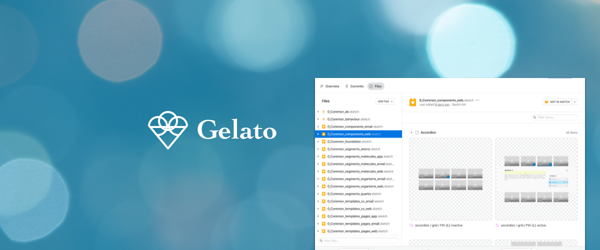
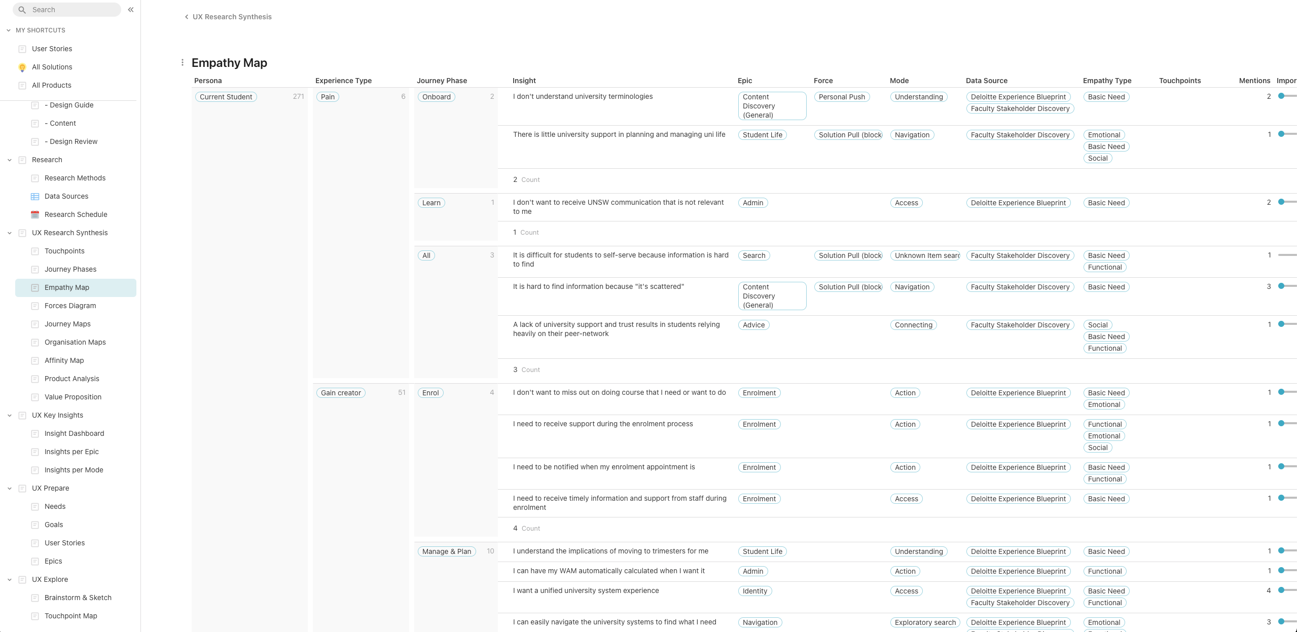
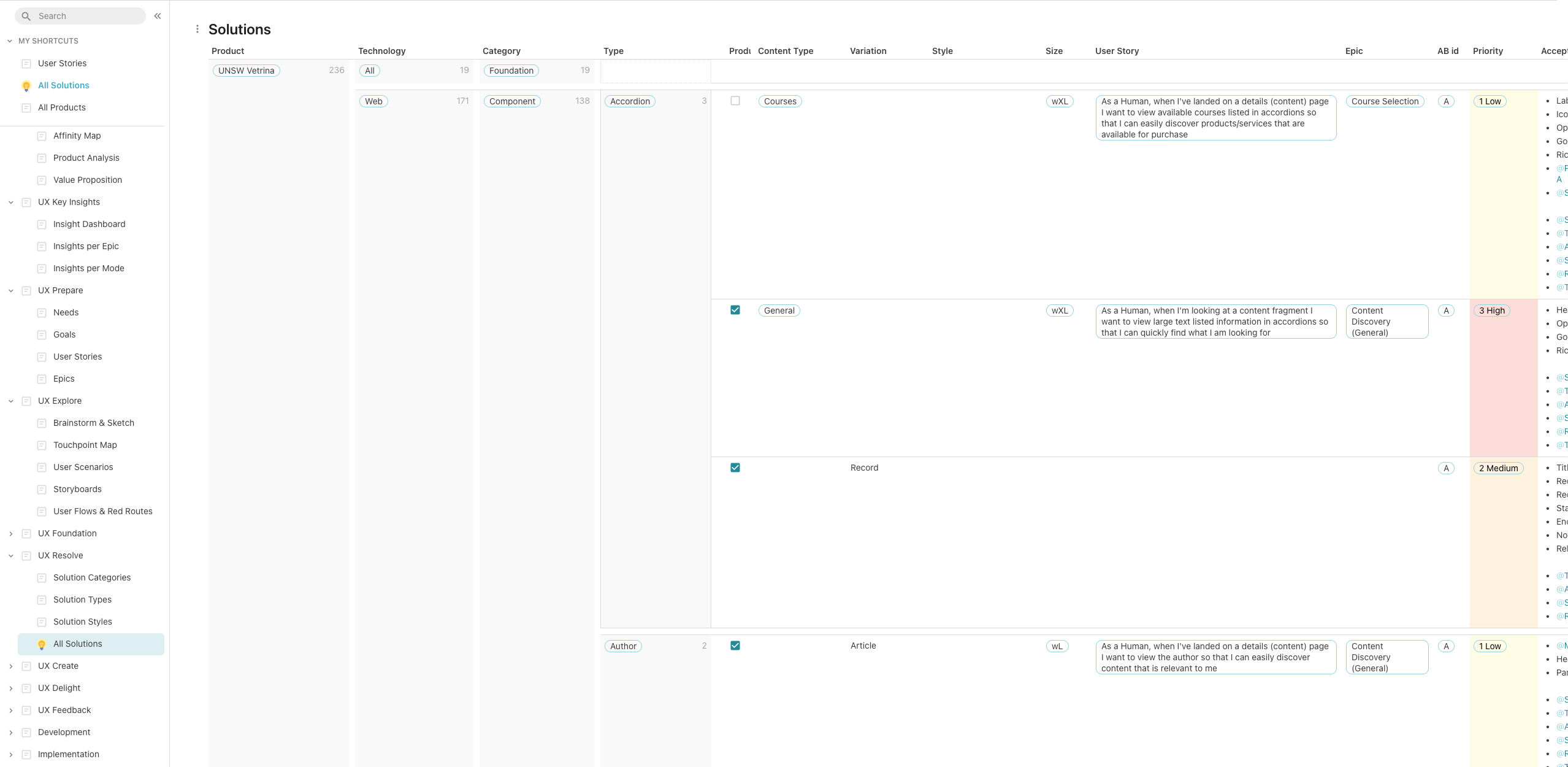
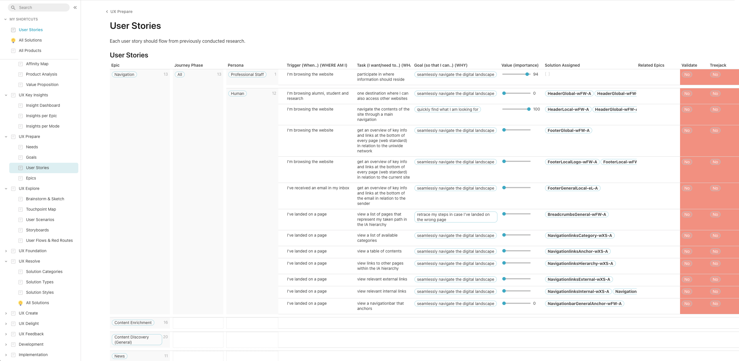
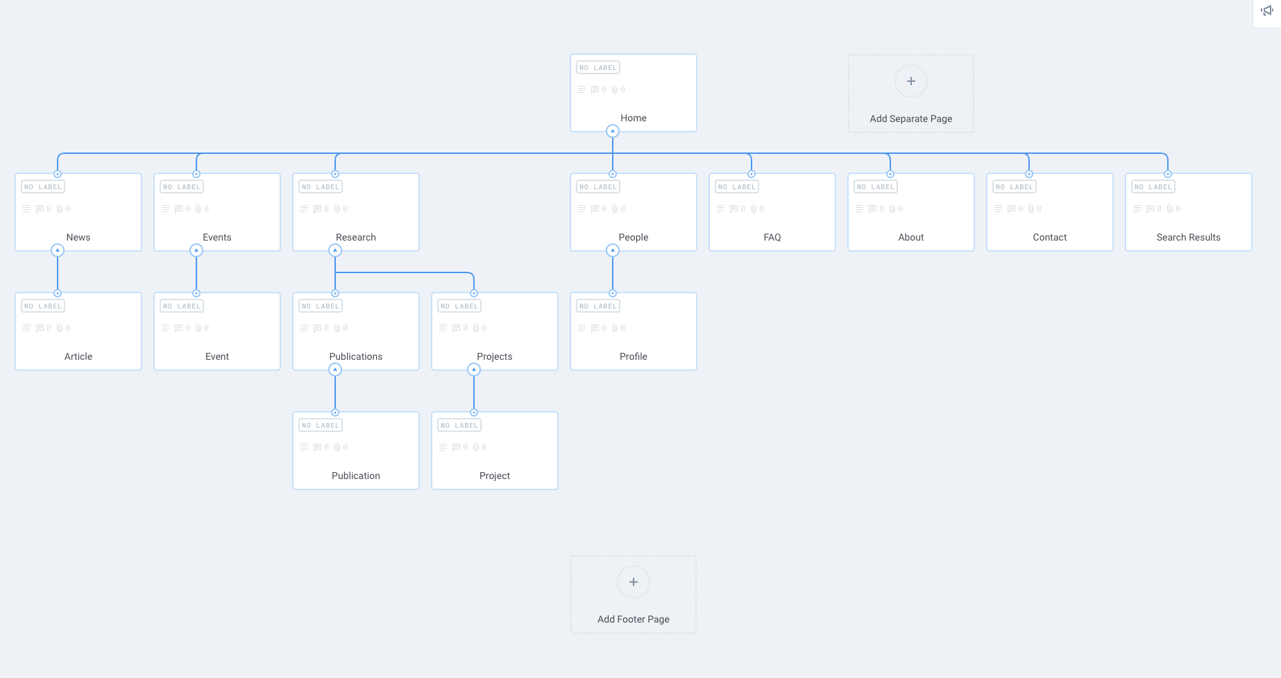
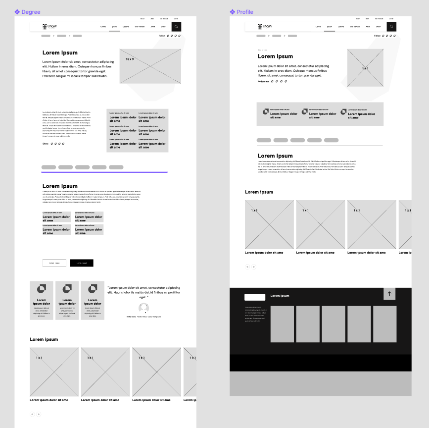
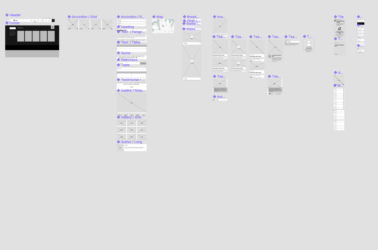
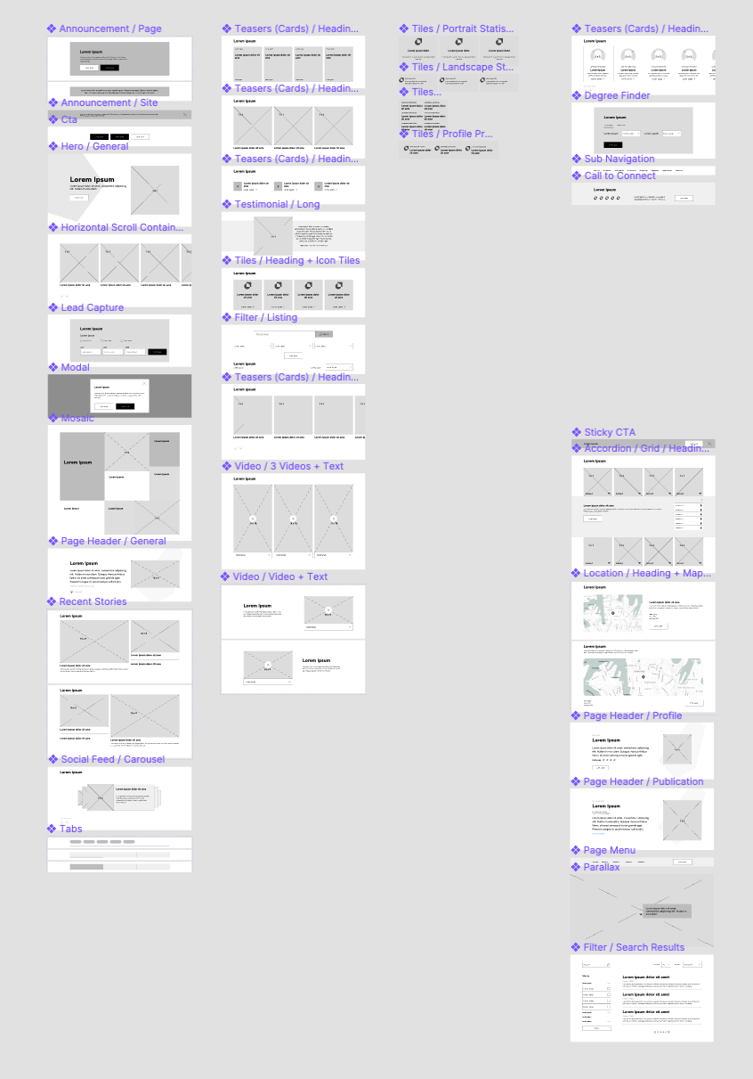
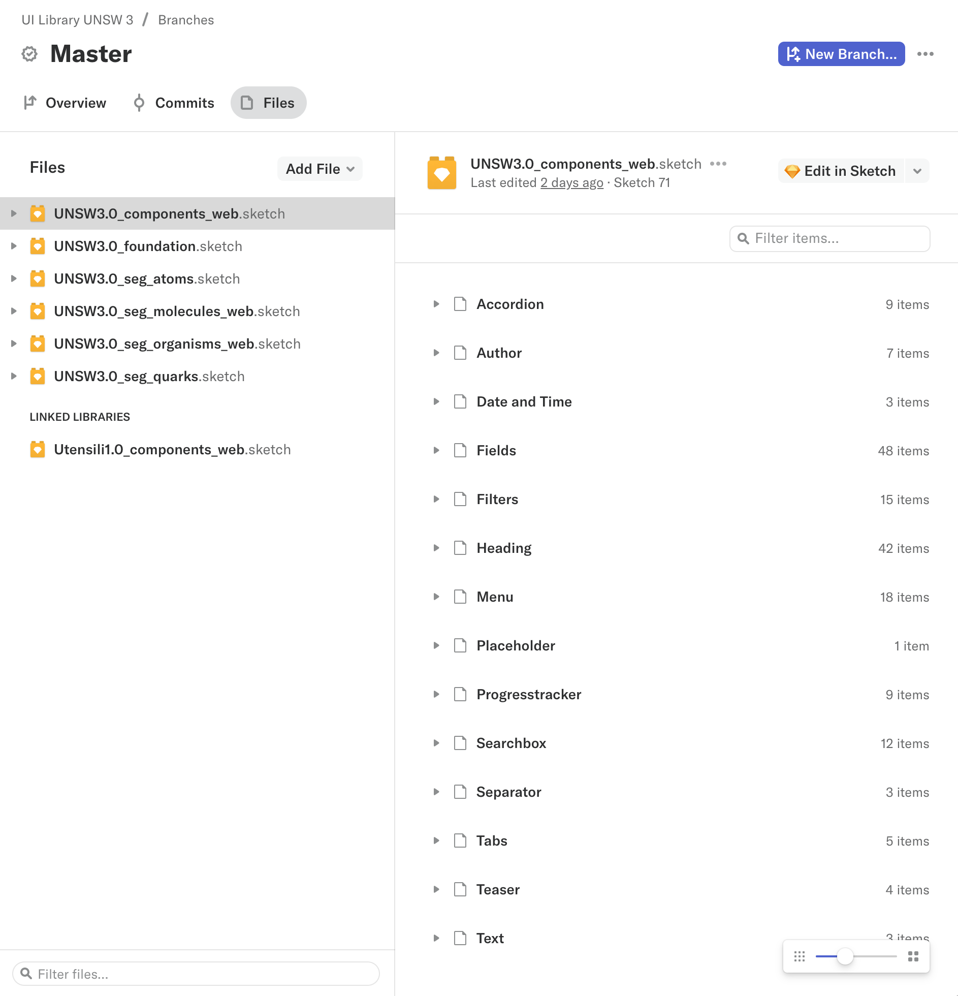
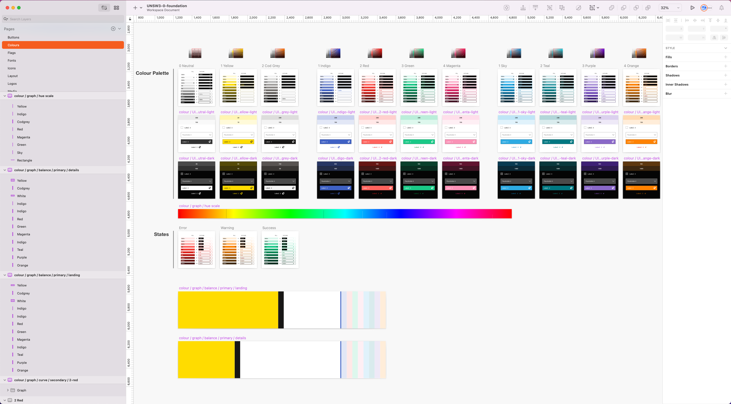
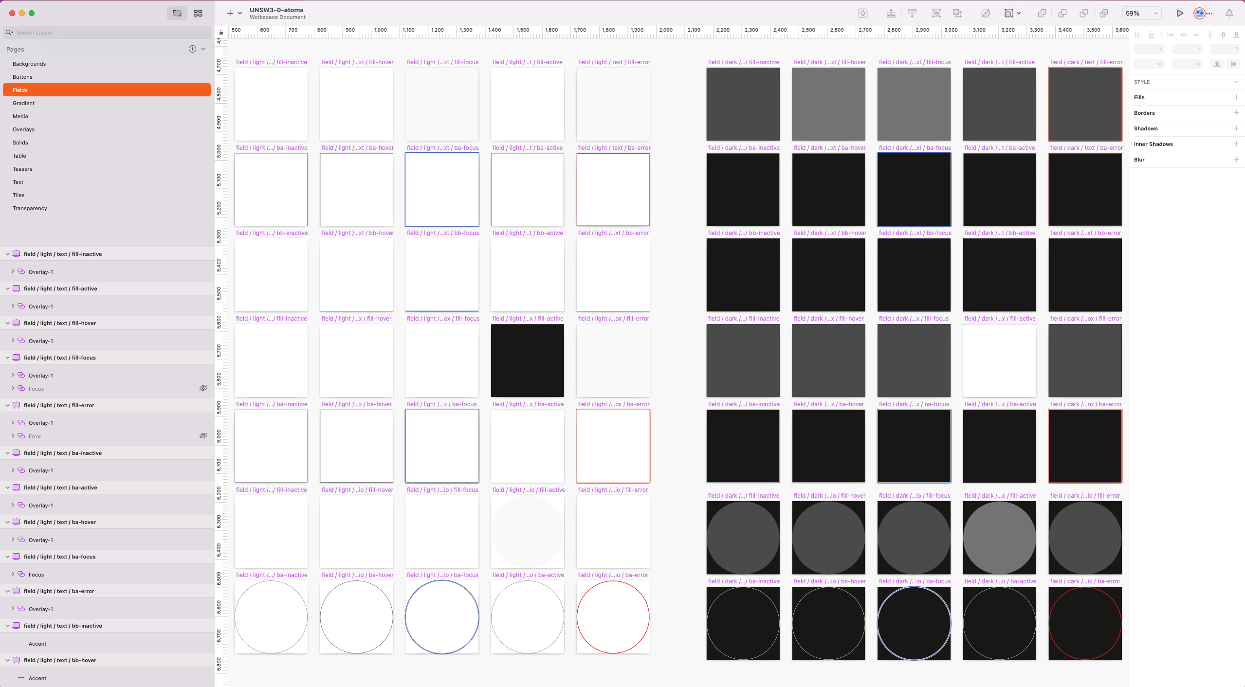
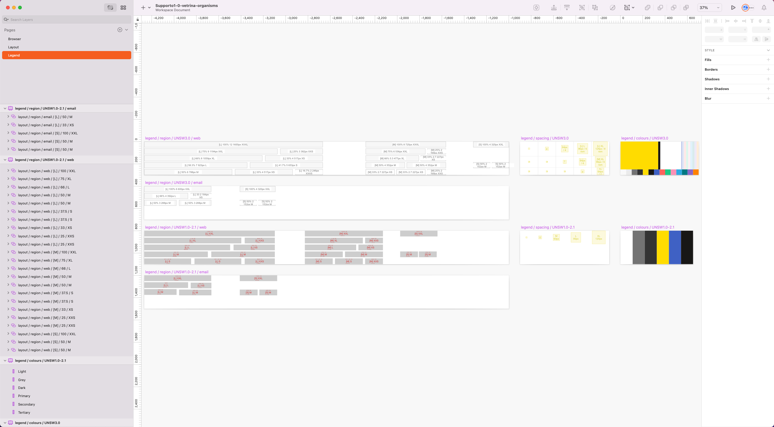
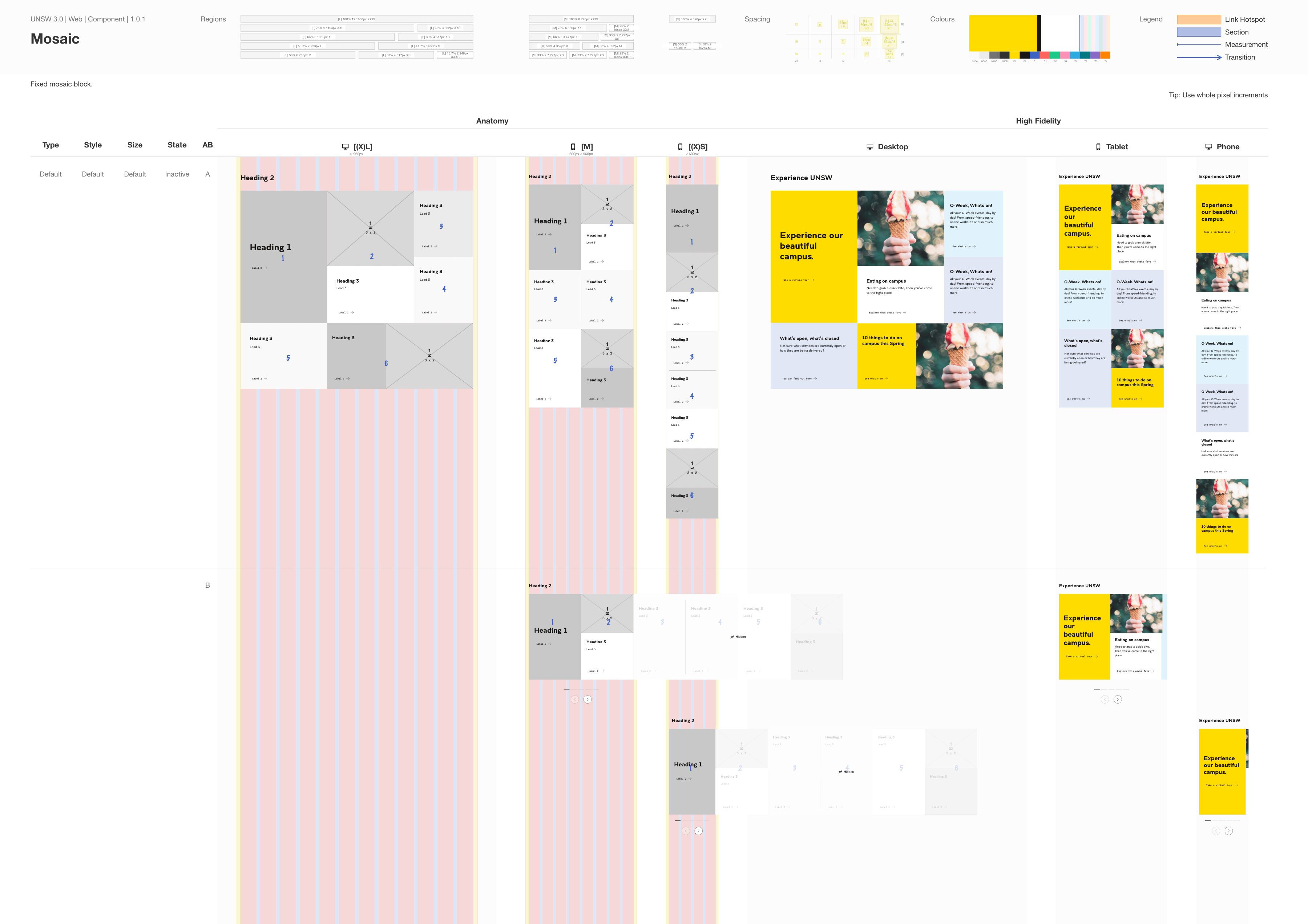
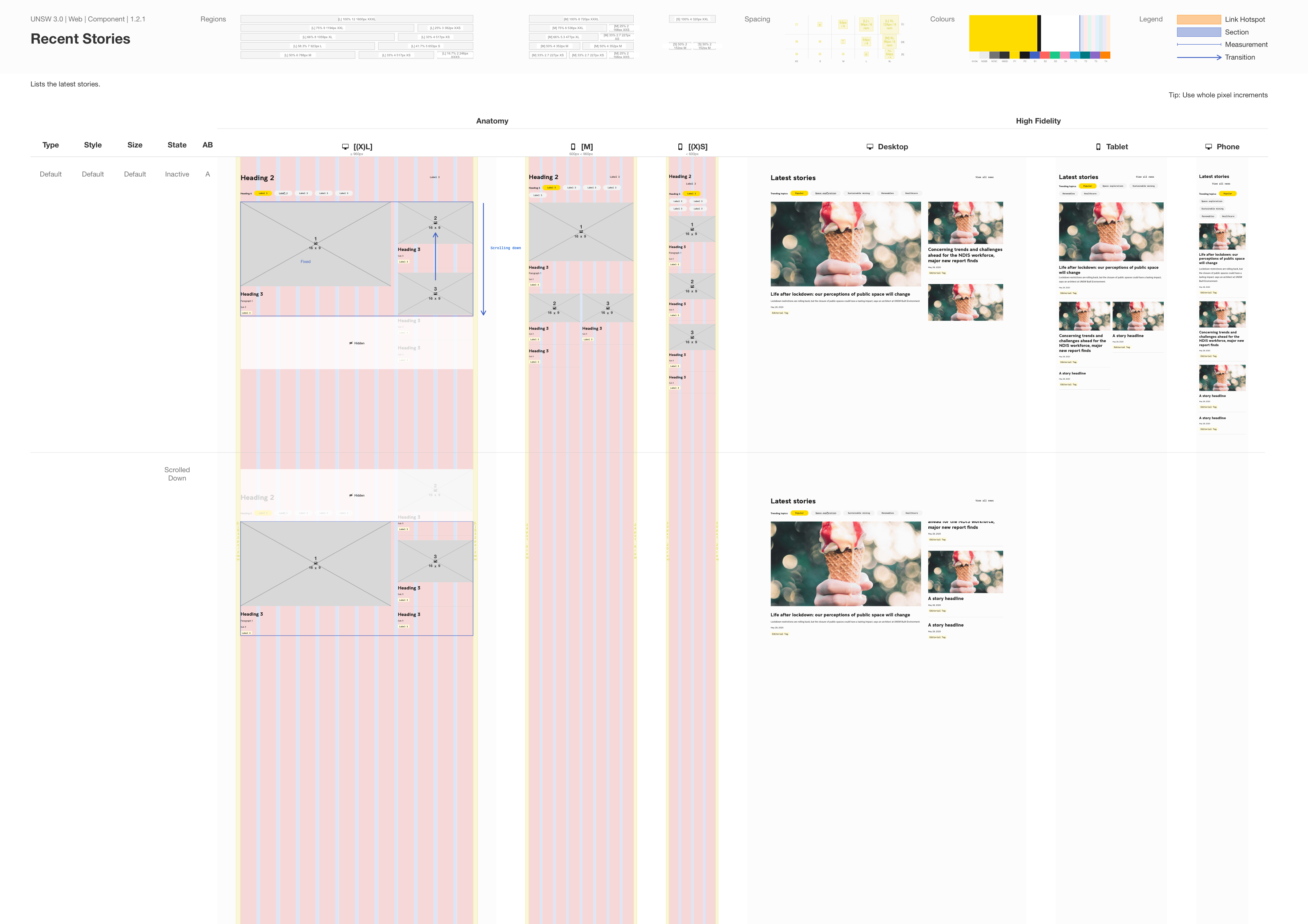
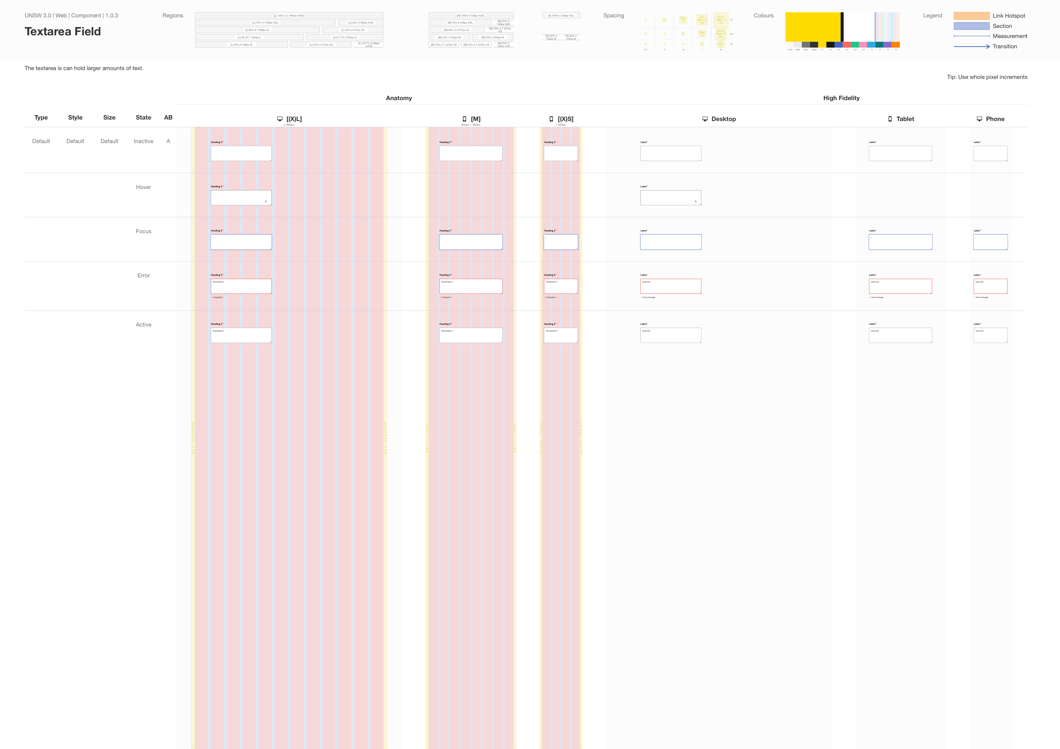
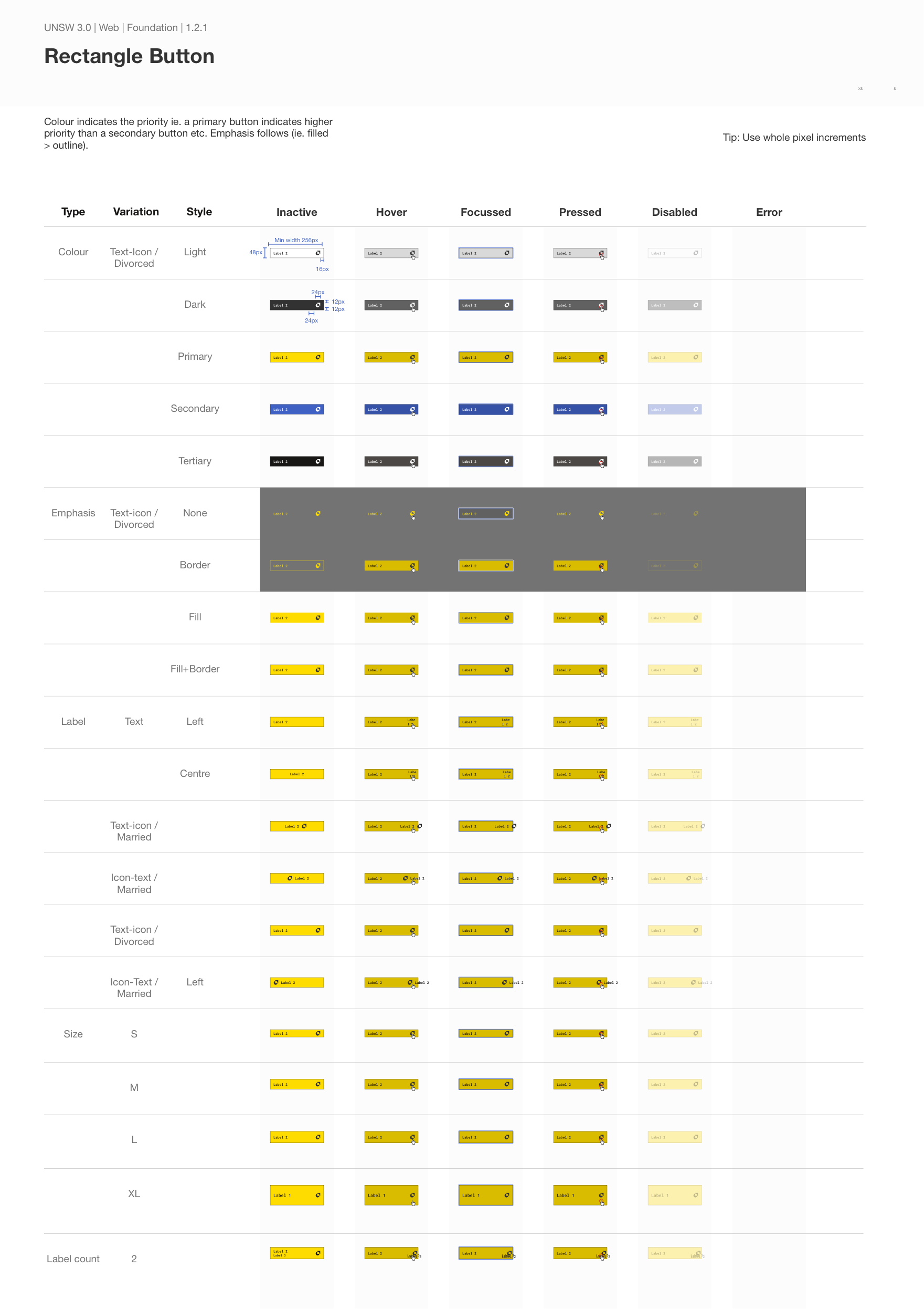
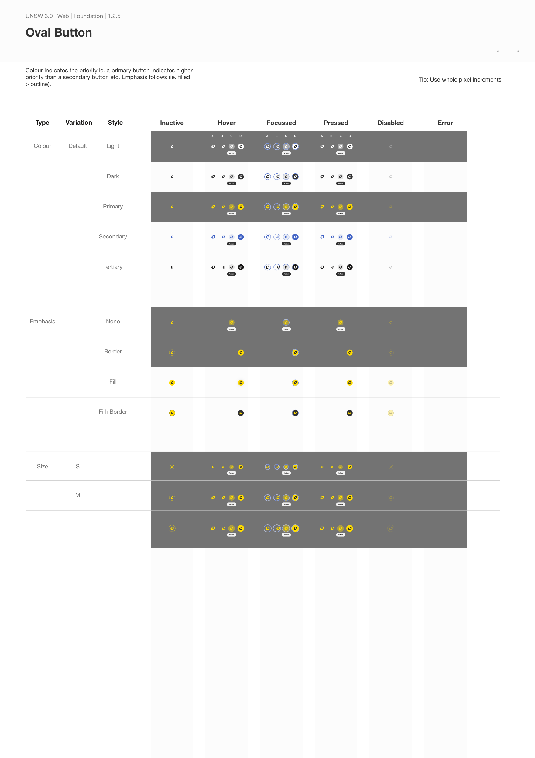
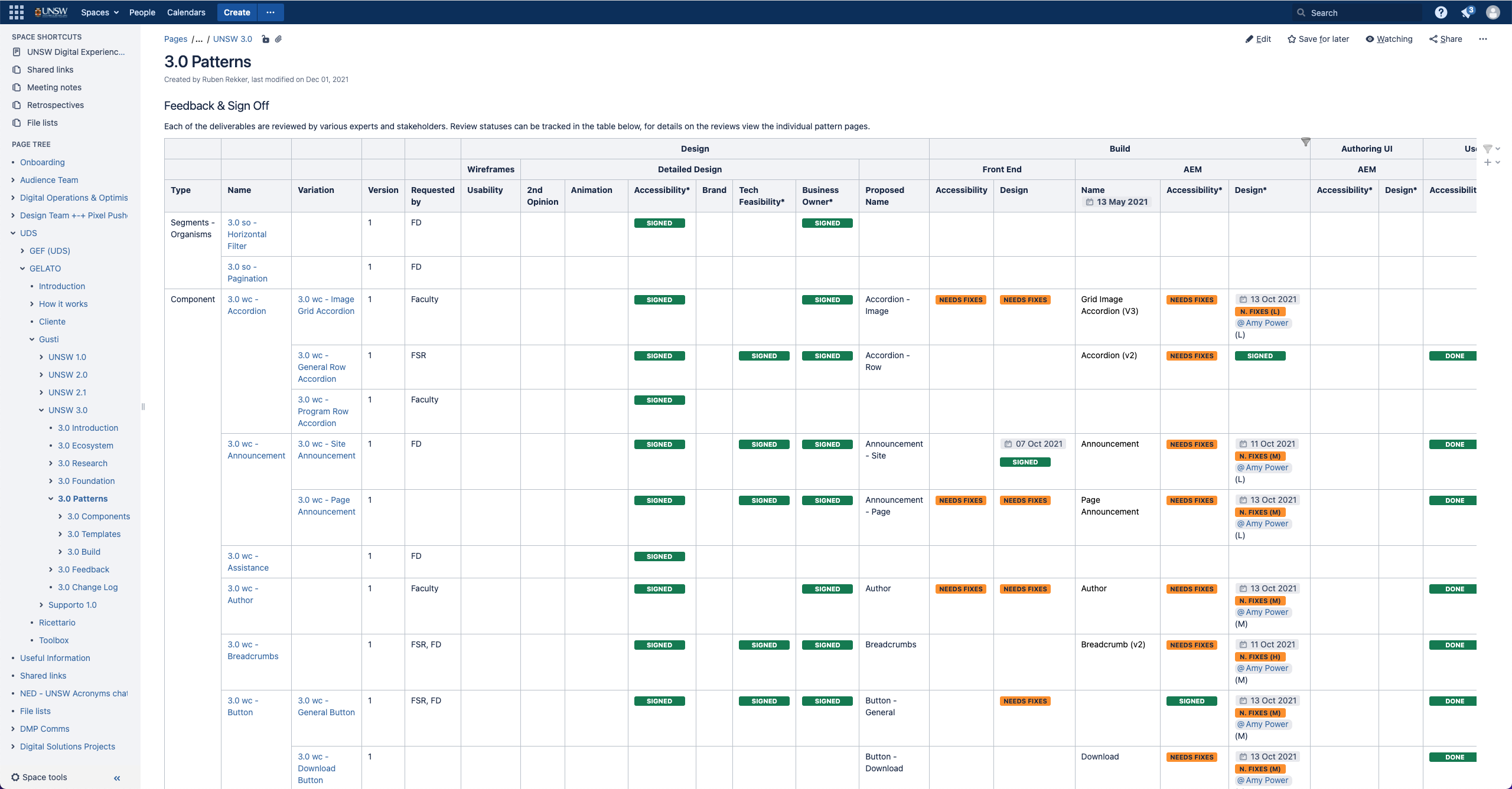
Gelato is a design system framework that was created to support a new global experience language that was being developed for the University of New South Whales. The aim is to deliver new designs, code and authoring instructions faster while using less resources.

A public repository that could serve as a one-stop-shop resource and knowledge base for every designer, developer, author or anyone else who needs to create a new digital project within the university, to get started and create something great with ease, would be the final output.

Process Map

Step by step

The Gelato framework looks at the research that comes in and crunches the information to gain useful insights, so that the succeeding design solutions address users wants and needs accordingly. It also has checks in place to gain feedback from users and to stay compliant with various stakeholders and authorities.

There are multiple parts to this framework, in which each can have their own tools (and specialists). The tools mentioned below were the ones that we used at UNSW, but can often be replaced by other tools that do essentially the same thing.

From the low fidelity design system onwards, the combination of all deliverables within the framework is called a gusti, flavour in Italian. So there can be multiple flavours, which basically function as versions of the GEL. The University of New South Whales has 3 so far: UNSW1.0, UNSW2.1 and UNSW3.0, each having their own distinct set of components and style.

1. Research Synthesis

Tool: Coda and Miro Contributors: Researchers, UX designers

Gelato starts at the synthesis of various data sources. The aim is to create a long list of problems and solutions, or pain and gains, that are formulated as user stories and that will eventually inform the requirements of the designs.

Data sources can be:

  • Surveys
  • Interviews
  • Workshops
  • Analytics
  • Third party research reports

Outputs can be:

  • Personas
  • User journey maps
  • Empathy Maps
  • User stories
  • Affinity maps
  • User flows

Note: Dovetail is a great tool for collecting raw research data.

2. IA / Sitemap

Tool: Flowmapp Contributors: Clients, Digital Engagement Officers, UX designers

To map out how a product should be structured, services like Flowmapp (or even Miro) have come a long way to help gain clarity on which pages or screens will most-likely be required and how they fit in the hierarchy.

3. Fast Prototyping

Tool: Figma Contributors: Clients, Digital Engagement Officers, UX designers

In order to gain quick feedback on designs by various stakeholders, all proposals are quickly drafted in Figma through as much collaboration as possible. Page models can be created first which can then be replaced by actual wireframes.

The space is meant to function as a playground or sandbox to encourage experimentation and creation without worry. It should be accessible by everyone and existing components can be referenced from a built in low fidelity design system.

4. High Fidelity Design System

Tool: Sketch and Abstract Contributors: Design System Architects, UI Designers

Once a new component has been given the green light, it is recreated inside Sketch as part of the high fidelity design system. This design system has several layered libraries, following a customised Atomic naming convention:

  • Foundation
  • Build: Quarks
  • Build: Atoms
  • Build: Cells
  • Build: Molecules
  • Build: Organisms
  • Selection of components (technology ie. Web or Email)

Not all components are created inside the design system as it can drag the system down. If they’re not, they are built directly on design boards.

5. Supportive Design System

Tool: Sketch and Abstract Contributors: Design System Architects, UI Designers

There are plenty of elements that are used in the high fidelity design system that in theory could be useful in any design or design system. Examples of these are mouse pointers, annotations, device frames, commonly used video services, design boards etc. These are all created in a general supportive design system that can be used by all.

6. Detailed Designs

Tool: Sketch and Abstract Contributors: UI Designers, Visual Designers

Design boards showcase the component in pixel perfect detail (hence detailed designs) and contain a design for every possible state so that a developer has as few questions as possible when they commence their build.

The list of final design boards are listed in an Abstract project called the “Vetrina”, inspired by the freezers in Gelato stores. These boards, created on A4 ratios for potential printing, contain the following:

  • Foundation
    • f-buttons
    • f-colours
    • f-fonts
    • f-layout
    • f-shapes
    • f-styles
  • Components (wc = web component, ec = email component)
    • wc-componentname
    • ec-componentname
    • etc.
  • Component Templates (a combination of components that is frequently used)
    • wct-componentname
    • ect-componentname
    • etc.
  • Page Templates
    • wpt-templatename
    • ept-templatename
    • etc.

7. Motion Graphics

Tool: Drama Contributors: UI Designers, Interaction/motion Designers

In case it becomes near impossible to convey the behaviour of a component on a flat 2d detailed design, an actual animation becomes necessary. I’ve mostly used Flinto in the past but we went with Drama at the time.

8. Internal Documentation

Tool: Confluence Contributors: Designers, Developers, Business Analysts and others

A component design requires continues improvement and collaboration from many different people inside a team. There is also more to it than just purely the design or an animation. For example, how many characters are allowed to fit in this component heading? Can this background be changed? If yes, which colours may be selected? All these are defined in the design and authoring rules that help to complete the picture of what a component does and how.

Then, each of these components need be approved for accessibility, technical feasibility, brand compliance, SEO conventions and then perhaps most importantly, by the client.

All this is recorded and tracked in an internal wiki space like Confluence, including the foundational elements such as the colours and the fonts.

Each page displays:

  • A summary of the component using a description and user stories
  • Related JIRA tickets
  • Changes to the design in a change log
  • An embedded Figma wireframe (for fast prototyping)
  • An embedded Abstract design board (detailed design)
  • An embedded animation if required
  • Design rules
  • Authoring rules
  • Internal feedback and sign offs on wireframes (usability etc.), design (accessibility, brand etc.), development (design review etc.) and build (authoring experience review etc.)

9. External Presentation & User Guide

Tool: KSS node Contributors: UI Designers, Developers, Business Analysts

Once a component is ready to be released, it should be easy for others in the organisation to grab it, use it and know how to use it. This can be done through a website that demonstrates the component, its function, its HTML markup and that contains a guide on how to use them. The Gelato name for this is ricettario, or cookbook in English.

View the AEM Design Guide website.

10. Final Page/Screen Designs

Tool: Sketch, Abstract and Invision Contributors: UI Designers, Visual Designers

To get an idea what a product eventually will look like, detailed designs are combined to form a final page or screen design. These can then be uploaded to services like Invision or Marvel to gain hopefully final feedback from others. If there is time (and budget), these could also be used for early usability testing.

Final Page/Screen designs are not always required. For example, if all required components have been developed already, they can be authored directly onto the platform and custom design can be bypassed.

11. External Feedback

Once the components have been deployed to the live product, continuous further feedback should be collected. Internal feedback will often come in naturally, but the goal at this stage is to gain the external feedback from the target audience. More info on this will follow soon.

Related Posts

The Evolution of Design Boards Part 2 Part 2 of exploring the best way to design within a GEL and to present these to developers and stakeholders.
Extracting user stories from research synthesis: Quantifying qualitative data An examination of how to get from various raw data sources to user stories from a UX perspective using Coda.
The Evolution of Design Boards Part 1 Design boards have a come a long way since its first inception to demonstrate how a component should transition from one state to another.
Building the ultimate GEL design system using Sketch & Abstract This is the journey on how a large enterprise design system was crafted using Sketch and Abstract.