In human centred design, the list of user stories (the “As a [persona], I want to [task] so that I can [goal]”) could function as the backbone of a service or product. Without them the designs would have little purpose of addressing real user needs, or at least be unknown to it. The user story describes who the design is for, what it should do and why.
But how do we get to this list of user stories? As you might have seen, the first part in the user story describes the persona and asks the question of who will be using the product. For example, is the user a time poor business man? An extremely tech savvy hosting administrator? Or a hands on construction worker? The type of your audience greatly determines what your product should do, how it should look like and how it should behave. So defining this list of personas is a must and one of the first steps of any UX designer or audience specialist. I’ve placed a couple of examples of personas I created for Laureate Universities in the Creating and comparing personas for Multisite post.
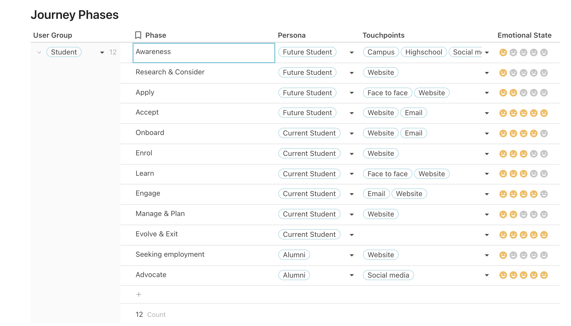
Next, we need to define what the different stages are that a user goes through to in their journey in relation to the service or product. These are the user journey phases. For a student going through the process of attending and completing a university degree, the phases could be:
- Awareness
- Research & Consider
- Apply
- Accept
- Onboard
- Enrol
- Learn
- Engage
- Manage & Plan
- Evolve & Exit
- Seeking employment
- Advocate
Both the personas and the journey phases can be retrieved by talking to (potential) customers and subject matter experts (SME’s). Common techniques to gain these insights include conducting surveys, interviews and workshops.
At UNSW, once we had a grasp on what the personas and journey phases were, I started by added these to a table inside a web document called Coda. Coda is a cross between a document and a spreadsheet and allows you to create tables that talk to each other. Another similar service that can do this is called Notion.
Here is an example of the Journey Phases list. Each of these have a persona assigned to it that is directly linked from the Persona table.
In Coda, the column that has the “key” value for that table, meaning this is what is being used when you refer this table in other tables, has a little bookmark icon next to the column heading.
Once we have the personas and the user journey phases setup, we can start to collate all the research that we have to date into a table called “Data Sources”. This research can be anything; preliminary interviews, surveys, reports etc., conducted either by us or by third parties.

Next, we can start to synthesise the data from the research into a table that is more or less a table-ised version of the “Empathy Map”. The traditional way of representing an empathy map is an excellent method to organise the user’s feelings, needs and wants. Read more about these in the From empathy map to value proposition post.
The empathy map/table starts with a persona column, as each of the following items applies to this. Then there are as many insights as possible extracted from the research and categorised by experience type.
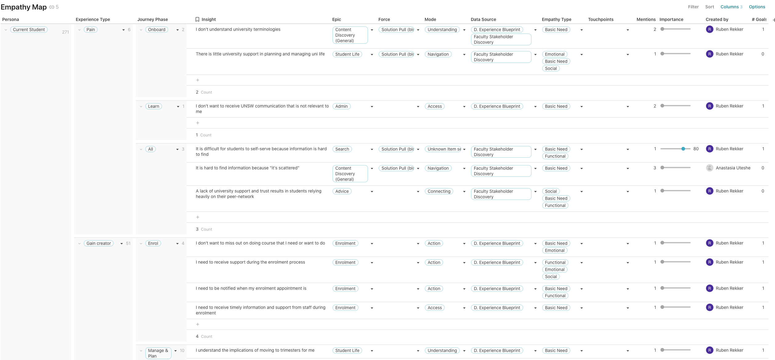
Some of the experience types are based on the original empathy map (see From empathy map to value proposition), however we came up with a couple of extra types:

At this stage we can also add other attributes such as epics, forces, modes and the touchpoints at which they take place.
Forces aim to highlight the direction of the drivers behind people’s decisions and whether they were internal or external.
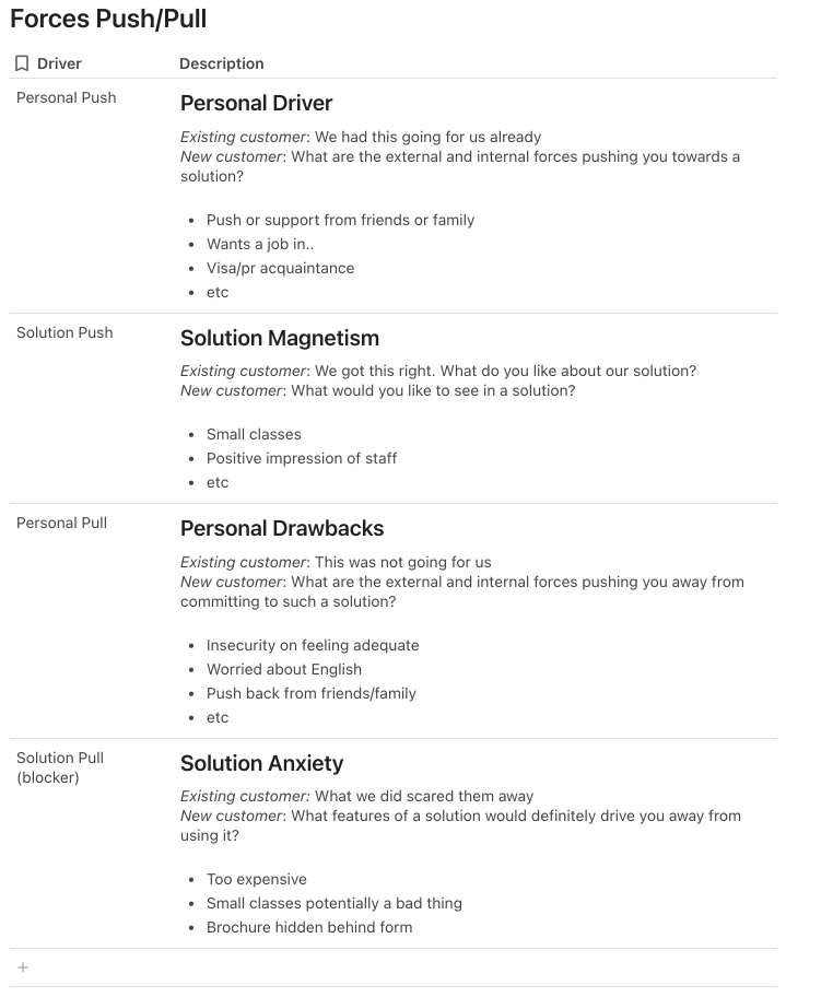
One of the benefits of using Coda is that you can create many views of the same original table without disrupting its data. So now that we’ve added a forces column, we can create another view of the empathy map table that sorts and groups the empathy map table by the forces; creating a nice forces diagram.
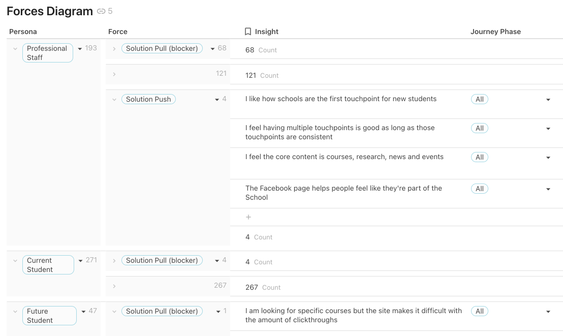
A handy way to determine priorities later on is to count how many times the insight was found in the research, which is added to the “mentions” column.
If a particular issue has been expressed as very important in the research, this can be recorded in the importance column by moving a slider higher up.
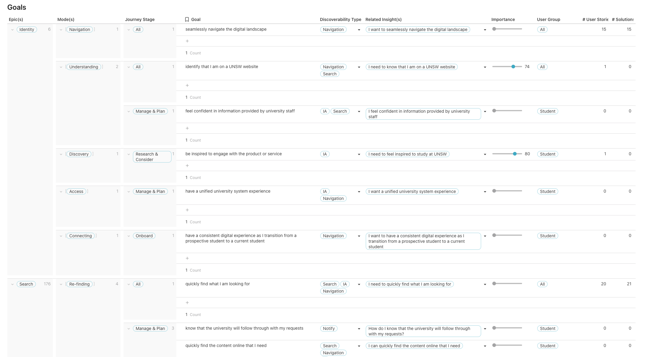
After the empathy map/table is done, we can start to think about what the user goals are for our product based on the insights recorded in this table.
To not lose track of how these goals are derived, their related insights are recorded in the “Related insights” column to their right.
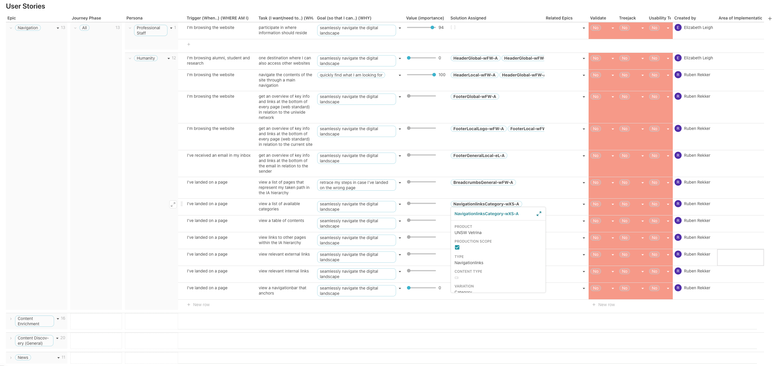
Once the goals table has been established, we can finally move on to the user stories. As you might have already guessed, we are recycling the goals from the goals table to automatically fill in the “so that I can …” part of the user story.
A user story normally consists out of the who, the what and the why. However, for additional context I’ve also added the when (read more about this here: From user story to user flow). Each of these go in seperate columns for now; they can be assembled into one sentence later using formulas. I’ve also added the journey phases and epics, which comes in handy to group and sort this list later.
The “Value” column helps in determining which story should be looked at first ie. the priority.
Then, it could be that some of these stories were based on hearsay from third parties, or that they were more like hypothetical suggestions. In that case, it would be good if these could be validated before they move on to the next stage. A “Validate” column that can be set to yes or no address this need.
If a user story requires the user to find a particular page or screen in a navigation menu, a treejack test could help improve its findability. The treejack test observes a selection of users who navigate through a menu (which is often tree-shaped), while carefully measuring their movements. The results of this test indicate the health of its taxonomy, ie. how well or how poorly its categories are structured. If user story could benefit from such a test, the “Treejack” column can be set to yes. (This will automatically make it appear on another page that is all about treejack tests.)
Finally, if a user story needs to be tested on (wireframe) designs for usability, the “Usability Testing” column can also be set to yes.
So what happens next, after we have this long list of user stories? We would have to come up with something that addresses them. However, this could be a lot of different things ie. it could be a web page, a component, a sequence of steps (user flow) or many others. The one thing that they have all in common is that they solve something, hence I named this new list (or table) “solutions”.
Inside the solutions table, I created a formula that nicely binds the who, when, what and why from the User Stories table together in a single users story sentence. Also, I broke down the priority into a simple low, medium and high.
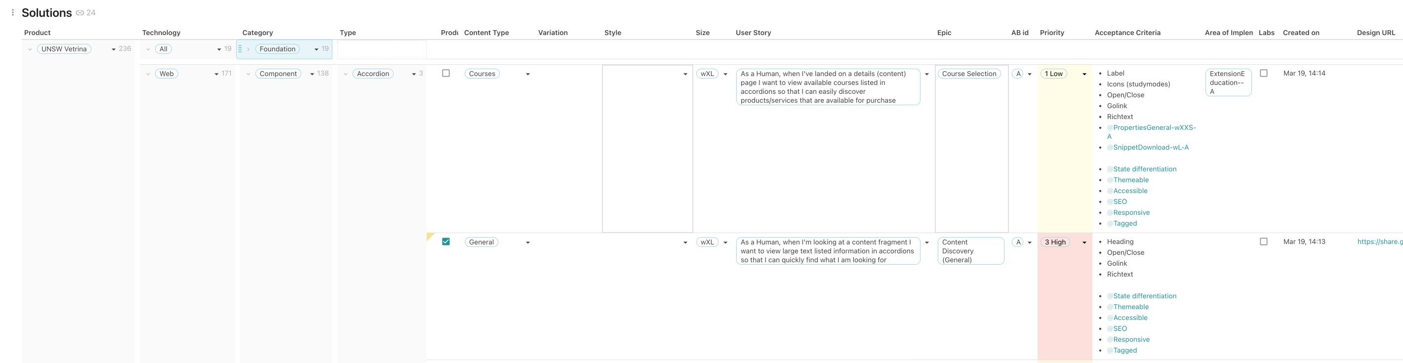
Near all of the artefacts that I would produce going forward, from user flows, wireframes and designs that eventually go to the developers, are based on this solutions list.
As all of these tables (data sources, empath map, goals, user stories and solutions) are connected, I can add columns that count how often they are presented in other tables. For example, in the goals table, you can see that there are two columns added at the end, # User Stories and # Solutions counting their recurrence respectively. This helps to ensure that all goals that are derived from the research, are addressed.
This concludes the entire journey from finding insights in all kinds of data sources to defining goals, user stories and eventually solutions from a UX perspective. I am certain that this process is not without its flaws and I would be keen to learn how this could be improved. I’ll keep adding to this post but if you have any suggestions, please do let me know.


