Introduction
After I was employed by a large university in Sydney, I quickly discovered that the institution looked after more than 2500 different websites. Yes, actual individual websites. Why so many you ask? Every faculty, every school, every research centre and every professor wanted their very own website.
At the time, we had’t much say over this enormous amount, but we could however modernise the efficiency and look and feel of new builds going forward. The in-house developers commenced work on a new multisite framework that maintained a single source of truth (ie. the header is updated once and it is automatically updated on all other sites too) and I started the creation of the equivalent in the digital design world: a new Global Experience Language (GEL) embedded inside a design system. We named it the Gelato framework.
What is a GEL?
Before we get into the nitty gritty, maybe I should quickly explain how we interpret our GEL and why I think it is useful.
As briefly explained earlier, GEL stand for a Global Experience Langue and it describes a system of re-usable patterns that is used to assemble all digital outputs (such as websites, applications and mobiles apps) within an organisation. It oversees the design of the individual patterns, information around the foundation such as typography and colours, it contains the front-end markup, accessibility, authoring rules and more. Having a GEL saves time; the designer doesn’t need to re-invent the wheel every time something new needs to be designed (or improved) and it assists in ensuring a consistent experience across all digital environments while keeping it on brand.
When we were naming our GEL, we discovered that adding the letters “ato”, or “And Task Optimisation”, to the GEL acronym, gave us a great reason to use Italian terms in our nomenclature going forward.
What is a Design System?
A design system helps speed up the process of design and development within the digital ecosystem of an organisation by integrating the GEL into the designer’s and developer’s tools. The design system provides ready-to-go design patterns and other design artefacts such as colours, fonts etc all stored in one place. Ideally, it also maintains a link so that if a master design pattern or style has been updated it will automatically also be updated in all of the places where it is used.
To explain a design system using LEGO, the design system would be similar to a LEGO box that you can buy in a store. The bricks are already researched, designed, manufactured and tested. All that is left to do is to put them together.
In the same LEGO scenario, the GEL manages the principles and theory, overseas the creation of new bricks and provides the manuals so that all creations adhere to the same consistent quality, message and look and feel.
This is a case study on how we built a design system for a large organisation that manages a large multi-website ecosystem. To stay within my field of knowledge, I’m focussing on the design part only and the tools that I used, mainly Sketch and Abstract, and their underlying relationships. It includes some of the major pitfalls that I encountered and how I managed to get around them.
Design System Requirements
Before we dive into it, it might be useful to define the exact requirements and their responsible tools:
Sketch
Design tool.
1. Should be able to pull designs from a UI library that has all design elements aka “stickers” that always stay up to date.
2. Component and page designs should have 3 breakpoints:
- Small
- Medium
- Large
3. All designs should be able to change skins or themes:
- Base theme by default
4. Design deliverables should be presented on “design boards”. In addition to annotation, these show designs for the different:
- Breakpoints
- Variations
- States (inactive, hover, focus etc)
Abstract
Versioning control and sharing.
1. Designers should be able to collaborate at the same time:
- Cloud based design sharing
- Git for design (branch, merge etc)
2. The designs should be viewable by computers not having Sketch installed:
- Inspection of designs by developers
- Gain feedback from stakeholders
A short introduction to Sketch Libraries
One of those first few pages at the university required the design of a new teaser. A teaser is a short clickable summary of an article that can be listed on a landing or index page. Clicking on this will take the user to the full article or page.
After having designed one of those teasers, the same teaser could be required at another page too, for example the homepage. One way is to simply copy the teaser from one design to another, but if the design changes then I’d have change this in two places.
Two places might be manageable still, but not quite anymore if this same teaser appears in 2500 places.
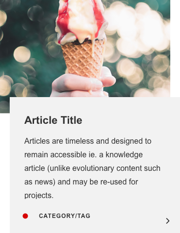
An example of an article teaser.
Sketch, a design tool that disrupted the (UX) design world since its creation, has the ability to use symbols. A symbol is a re-usable design element that sits inside a document. Consider it a “master” design element, comparable to smart layers in Photoshop. Instances of these symbols can be placed elsewhere in your design and if the master symbol changes, all instances of the master symbol automatically update too. After Sketch, more tools such as Figma have entered the market giving the designer a bit more choice. However, the principle of symbols is in near all of these tools the same.
On top of symbols, text styles and layer styles can also be saved. These store font styles and layer styles, which could contain colours, gradients and other visual styles.
For many years, such symbols and styles were limited to the same Sketch document. This all changed in 2018 when the ability to turn a Sketch documents into a library was released. This finally opened the door to having many website designs use the same library of symbols and styles.
One library to rule them all
If there is only one library, there is also only one source of truth. Each designer can create design products much quicker by calling elements from this library that always stay up to date.
In our first library file, we grouped the contents inside the library by foundation (1), components (2), templates (3) and segments (4). Each of these were spread across several pages inside the Sketch library.
1. Foundation
The foundation page contained items that are shared across the library and that in theory could be defined as global variables in the code, such as colours, buttons and fonts.
1.1 Backgrounds
Even though layer styles are very useful, especially since multiple attributes such as fills can be stored in one style, they still have limitations. For example, sometimes a layer would require a combination of already saved layer styles such as a border and a shadow and then it would become a very tedious to create a new style for every possible combination. Also, it is not possible to allocate a size and exact location to something that sits inside a layer style.
Creating a set of symbols called “backgrounds” with multiple layers of correctly positioned layer styles (and other objects) provides a solution to this problem. Instead of overriding a style, the background symbol is overridden with another background. Even then, layer styles can still be overridden if required.
A screenshot of a part of a page that lists various different background symbols. A background symbol can contain richer design elements than layer styles.
1.2 Icons
Icons are placed on art boards that are all the same size (ie. 24px by 24px), so that they can easily be replaced by another icon in the symbol override settings. Each of these icons also has a layer style applied so that this can also be overridden, as it can’t without. Laying each icon out on a grid also allows for easy exporting.
As we purchased a third party icon library that contains over 30 000 icons, we only use this page for icons that can’t be changed by the author in the CMS (ie. an arrow or a search magnifying glass). In case that the icon can be chosen by the author, we use a placeholder icon by default (which is also listed on this page).
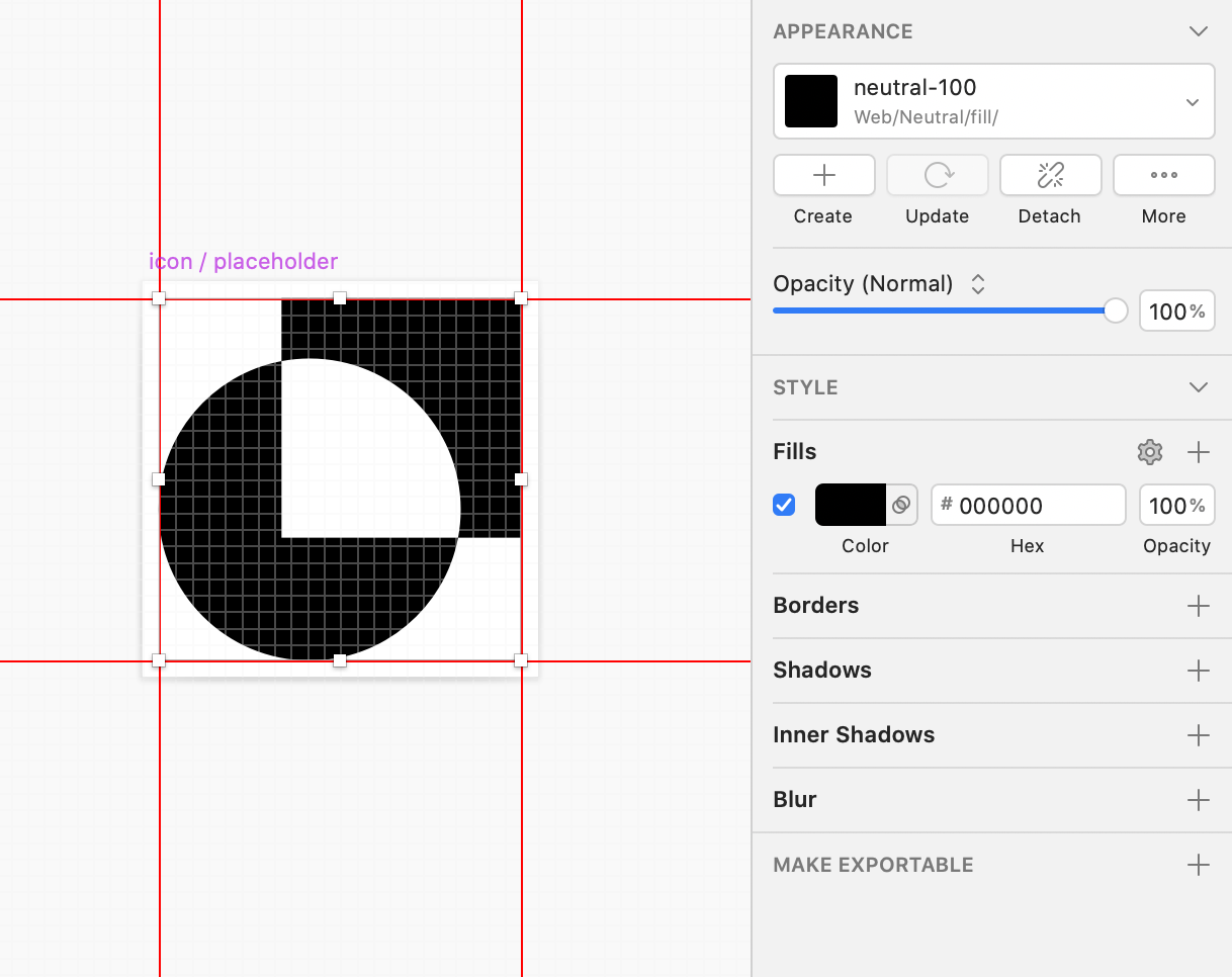
The icon grid lists icons inside symbols with a layer style applied for more flexible overriding settings in the symbol instance. We only import icons that can’t be overridden by the CMS author.
1.3 Typography
This page lays out all the font styles. When they are all laid out it is easier to see what font styles have been created and also to edit them.
At the time of writing, Sketch doesn’t allow overriding of alignment, so a seperate set had to be created for each.
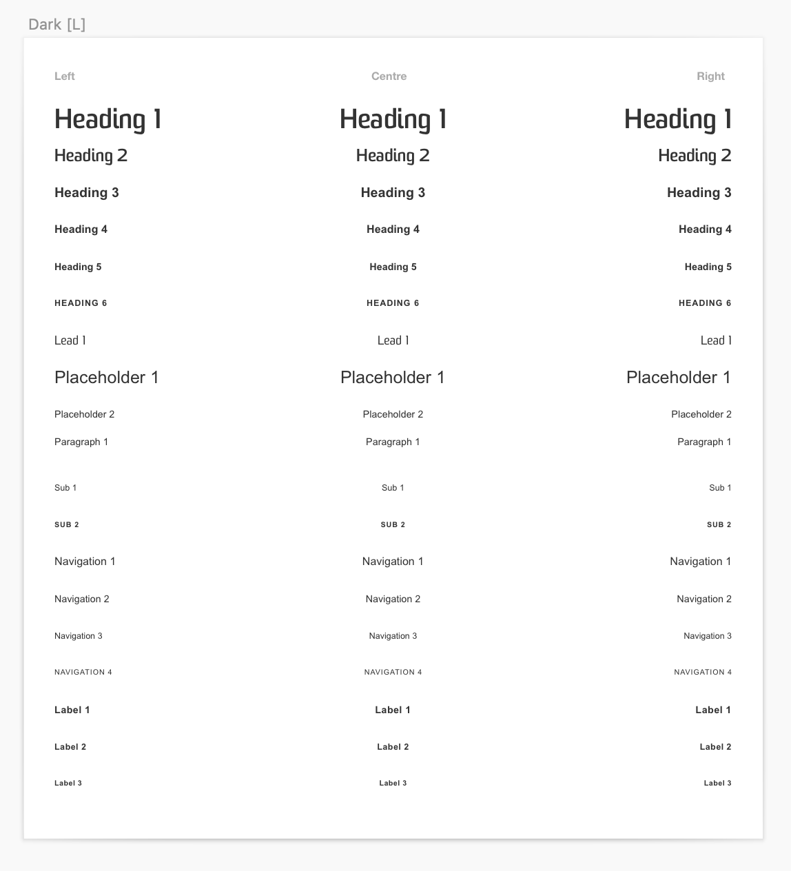
A font set with 3 alignments; left, centre and right.
Some fonts styles should reduce in size on tablet and mobile devices and Sketch also doesn’t allow text colour to be overridden. So the final typography page has a set for each of the 3 devices and for each of the colours.
All font combinations: left, centre and right aligned and in light, grey, dark and the primary colour group: yellow, blue and coal.
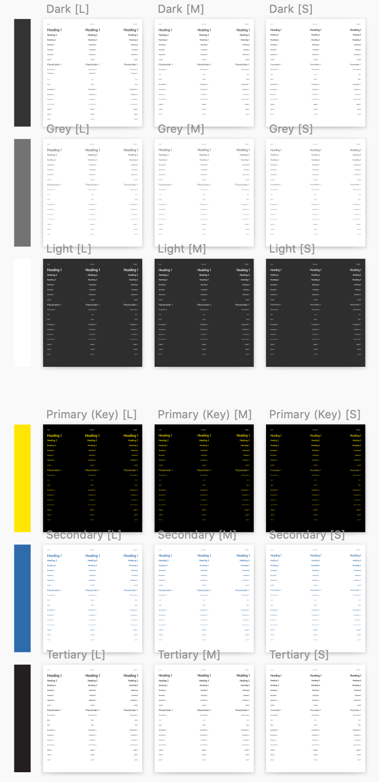
1.4 Colours & Layer Styles
The colour and layer styles are laid out for similar reasons as the font styles; to (re)view and amend them if needed.
Each colour in the palette consists out of 10 shades that are derived from following a curve on the Hue Saturation Brightness (HSB) graph. Subsequently, a couple of variables are chosen from these shades that are frequently used in the designs, such as the key colour and several background colours. The remaining shades can be used as supportive colours where necessary.
There is one monotone greyscale and several colour groups or sets. The primary colour group for this theme contains yellow, blue and coal and these are also used for the different font colours.
The Colours and Layer Styles page lists all colours and layer styles. To gain instant feedback on the effect of these styles, some symbols such as buttons and fields are placed underneath so that changes in styles can be directly measured and placed in a bit of context.
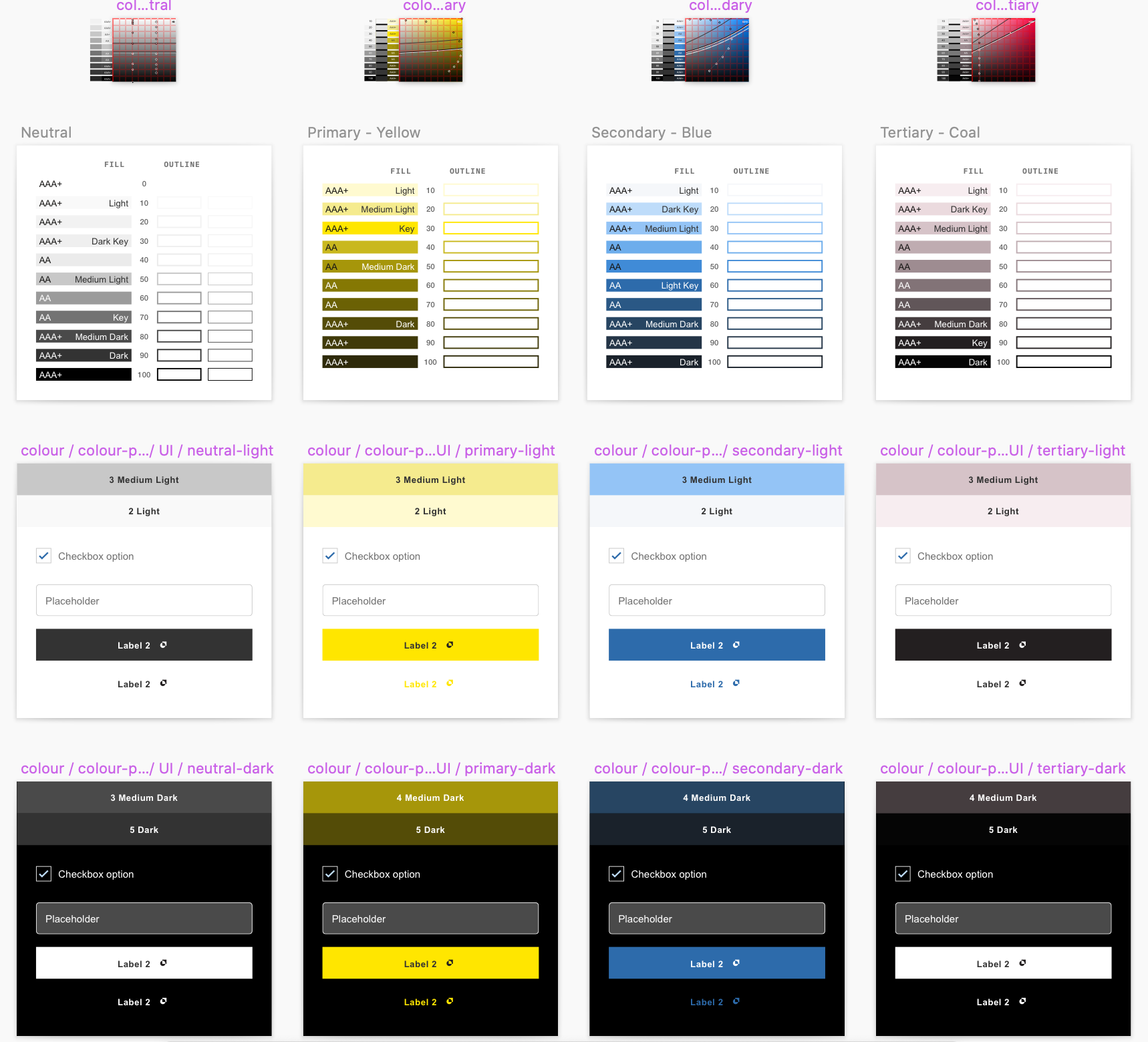
A brief explanation of the HSB curve
The amount of saturation in colour could change depending on the function of the element that the colour is applied to. For example, in our base theme we’d like buttons and links to stand out but we’d like for background colours to be a bit more bland.
In this case we could increase the saturation around the middle (key) colours that are often used for buttons and links but remove saturation around the lighter and darker variations of the colour that are often used for backgrounds.
This change of colour can be visualised by a curve on a Hue Saturation Brightness scale. The curve on this scale often differs per colour, so each colour of the colour palette gets its own scale.
I’ve manually created a HSB scale for each of the colours by creating a 100px by 100px grid based on each of their hues respectively.
An example of an HSB colour chart, based on the blue in the colour palette, which has a hue of 210 and informs each of the 10 colour shades.
Each of the 10 circles in the graph has one of the 10 layer styles applied so that we can track their curve over the HSB scale.
The lines that start on the left of the scale and curve up to the right represent the cut off for the colour to comply with the desired contrast ratio to meet accessibility standards. The top dark line represents the colour of text, the bottom light line is the colour used in many backgrounds.
1.5 Buttons
Buttons are a tricky one and we’ve gone back and forth on deciding where these belong. Is it a component or a foundational item? Or a segment? Eventually we settled on that they are both a component and a foundational item. It is a component when it is inserted by the author, but it is foundational when it is used in other patterns.
There is actually also a strong case for it to be a segment (a molecule to be precise, read more about segments below), but we currently divide molecules into different technologies such as web and email and buttons are (so far) the same across both.
As the hover/focus state can be quite different, they have their own symbol too.
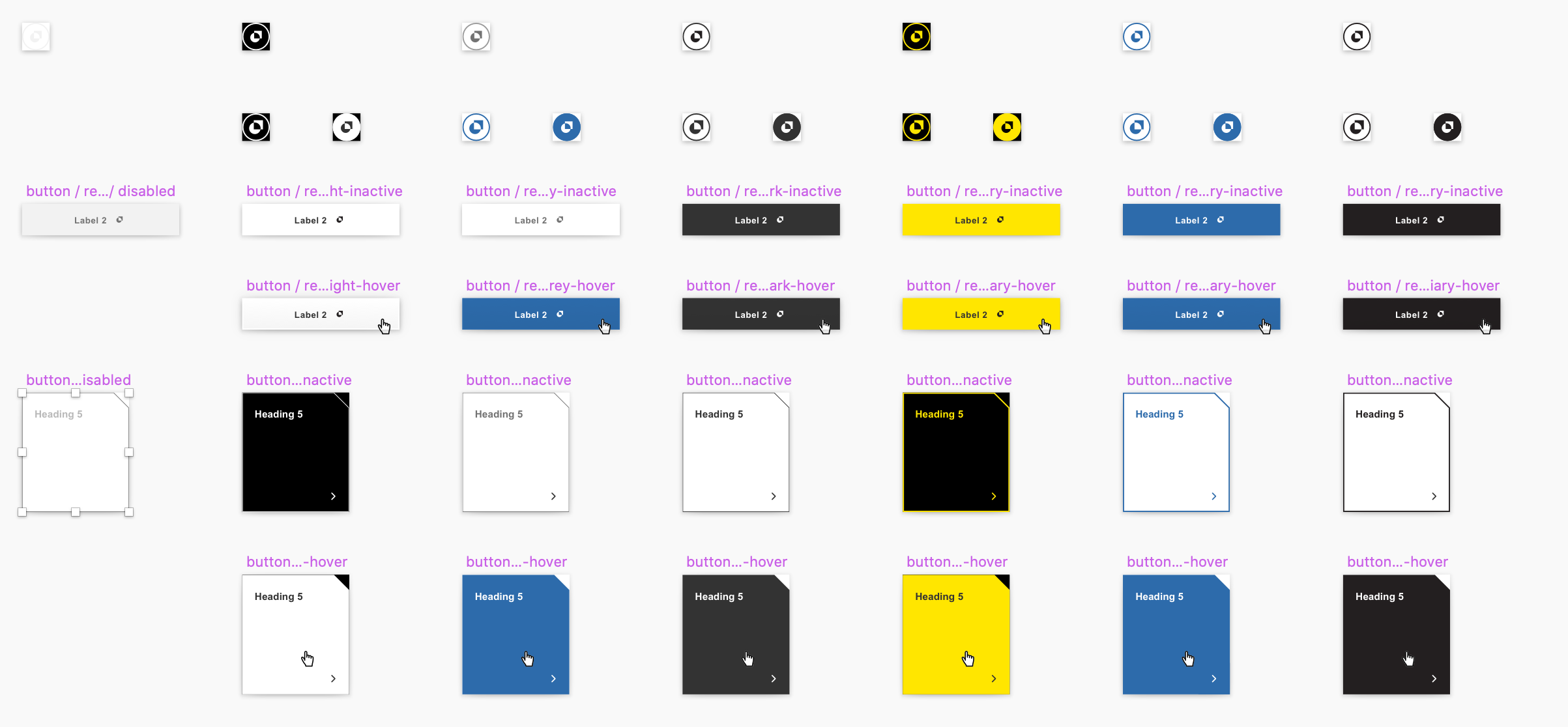
Button variations on the button page have three states: disabled, inactive and hover/focus. Other states and variations can be created from these in the override settings.
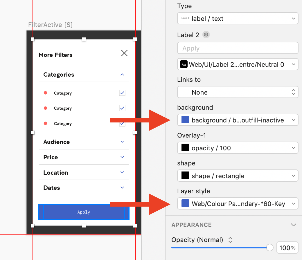
The button consists out of 3 symbol layers: A label (1), a border (2) and a fill (3). See an instance example below for how the overriding works.
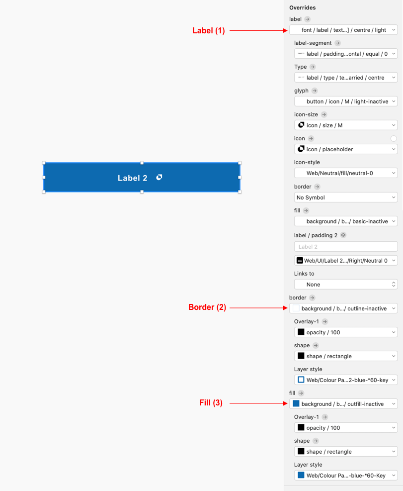
A button has 3 top layers: label (1), border (2) and fill (2), where the border and the fill are background symbols.
Label (1)
Treating the label as a separate symbol gives us the flexibility to swap this out for different variations such as an icon and text, text and an icon (separated or not) or only text, in different colours and in different positions.
You might find that overriding text next to an icon will push the text out making the label no longer centred in the middle. This Anima plugin allows you keep these two centred at all times.
Border (2) and Fill (3)
Inserting the border and the fill as separate background symbols allows the designer to choose which one of these require to be active. Each of these background symbols have different states defined such as hover, focus etc so that it is easy to swap these out for other states eliminating the need to create seperate buttons for each of these states.
Each of these background layers consist out of a transparent symbol that then contains a shape symbol (these are quarks, read more about them below). This way the transparency as well as the shape can be standardised while continuing to make use of the layer styles.
2. Components
2.1 What is a component?
A component is a pattern or a re-usable piece of functionality that could be inserted or removed onto a page by a page author. A carousel, a header, an image or a text block are all examples of components.
The component symbols in the library were originally placed on a single page called “Components”, but as the library grew bigger it made sense to group all symbols that formed one component on a single page.
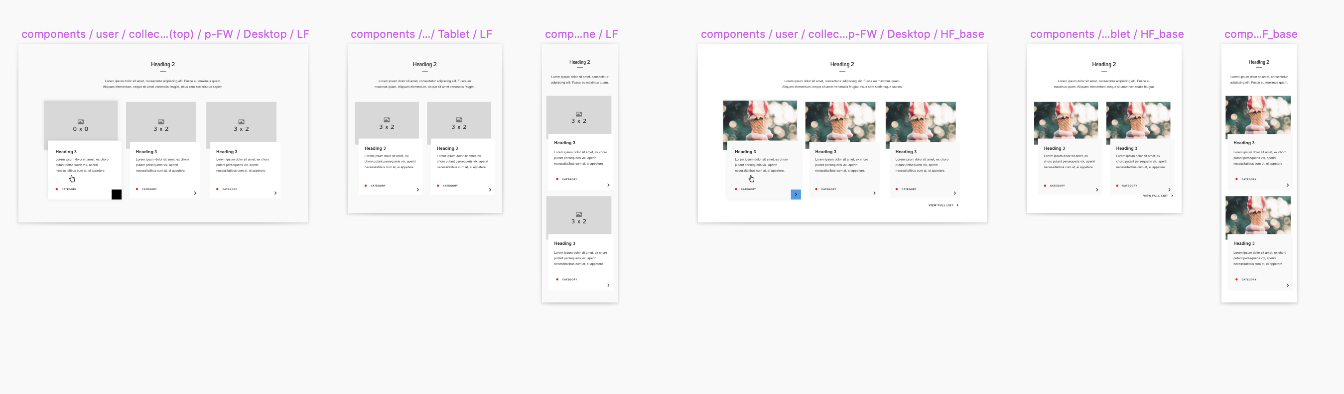
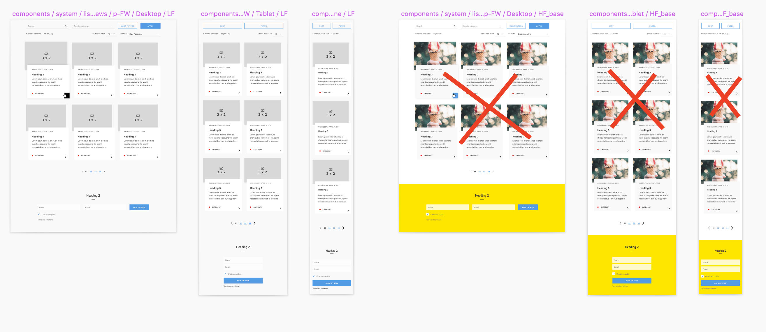
A component could have several variations, for example a news teaser could look different to an event teaser, but it could also look different depending on the size of the viewport.
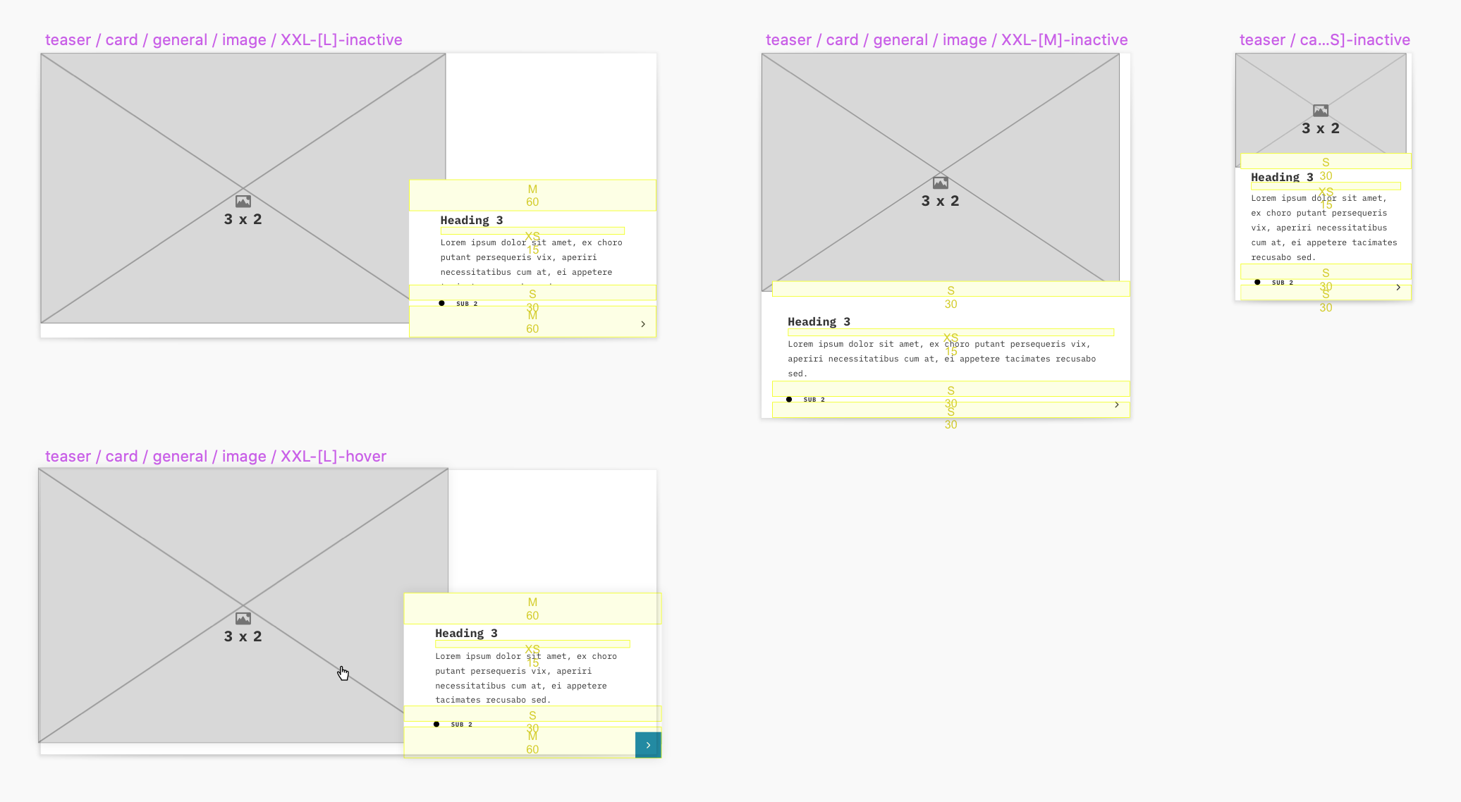
An example of a news article teaser component in low fidelity or wireframes. The component has a design for three sizes: large [L] for desktops, medium [M] for tablets and small [S] for phones. It also has a design for the hover state on desktops.
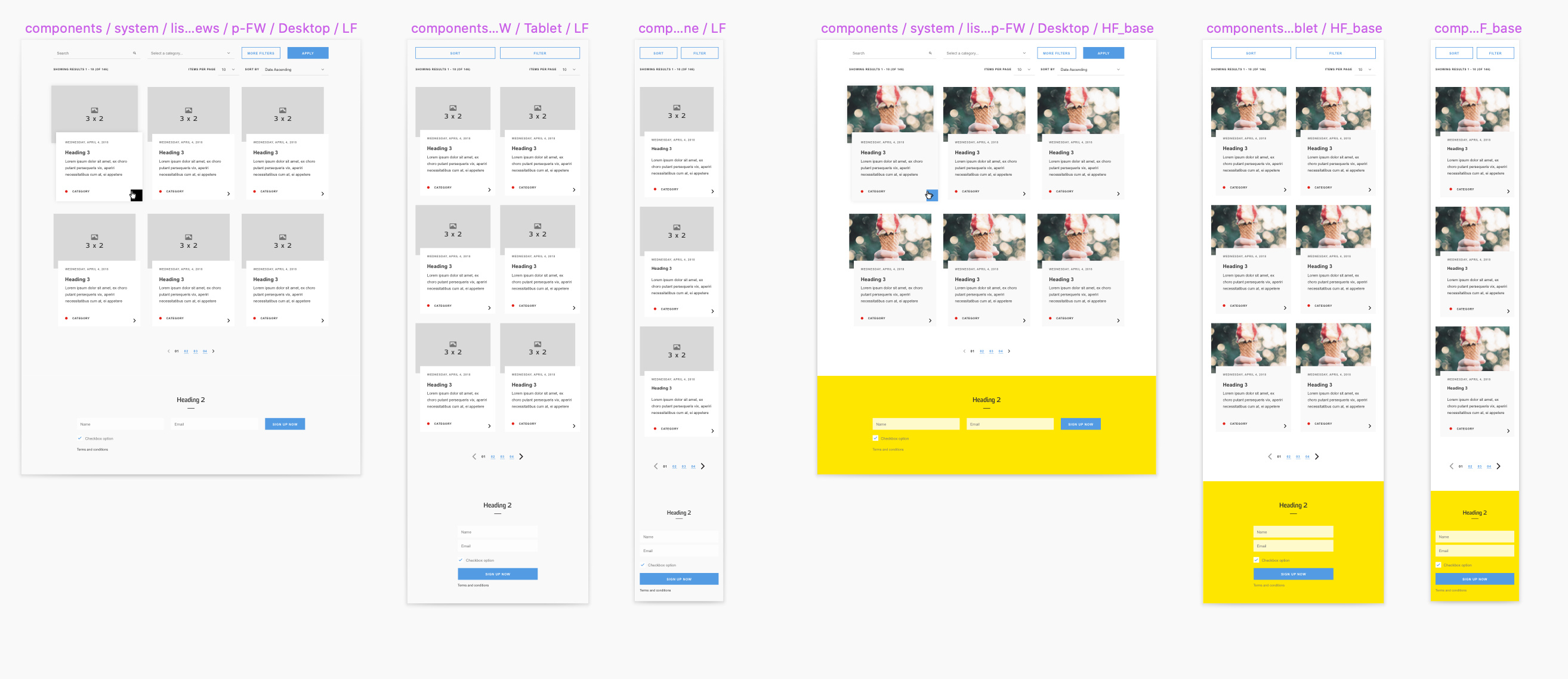
2.2 Emulating themes: same structure, different look
In UX, low fidelity wireframes are often used in experiments to determine what should be on the page, where it should be placed and how it should behave. They often consist out of grey lines and boxes which can be created quick and dirty. The more high fidelity designs that contain the finer colours and other details comes after when the general structure has been established.
As there is always value in keeping the wireframes look, I wondered whether both the low fidelity wireframes and the high fidelity designs could be treated as “themes” that are applied to the same design structure.
So I started experimenting by placing a new symbol of the exact same size next to a wireframe component and placed the component inside the new symbol as an instance. Then I started overriding the symbols and styles of the wireframe component until it had lost all wireframes and looked completely high fidelity. Anything I would then change in the original wireframe in terms of position or structure would also immediately change in the high fidelity symbol next to it, but it would keep it’s high fidelity styling. Perfect!
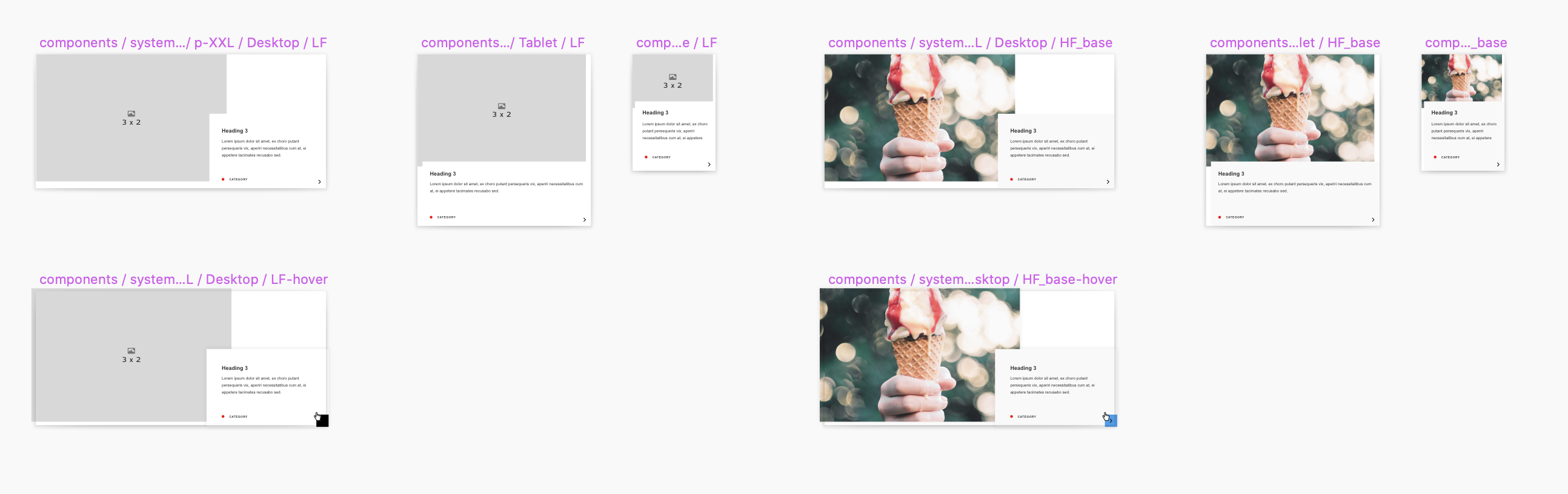
To emulate themes, I created new symbols to the right, imported the left symbols as instances and started overriding the styles of these instances.
3. Component Clusters
3.1 What are Component Clusters?
Sometimes I would use a bunch of components in the design together, but always in the same way. Such as multiple teaser cards, a background and a text component. Or a text component to the left of a map component. I could rebuild these every time, or just create a symbol for these component collections too.
I called them “component clusters”.
I called a collection of components that was frequently used a “component cluster”.
4. Page Templates
4.1 What are page templates?
Finally, there were also a couple of pages that would also be handy to be standardised. Obvious examples are the search results page, or the 404 page. So I placed these inside symbols too for easy accessing.
These pages would primarily consist out of component clusters if they existed, then out of individual components if they existed and so on.
Entire page designs that repeat and do not need to be authored (frequently) are called “page templates”.
As you could tell from the image above, I kept using duplicates with the low fidelity version on the left as the “master” and the high fidelity version on the right as the “reader” for all items from components onwards.
In theory, it sounded great. As a designer I can go “page template > 404” pick a theme and I’d be done. But creating the “reader” symbols this way also meant that I could not select multiple items to change at the same time. I’d have to do everything one by one in the override settings. This, amongst a few other reasons actually made me move away from this technique. Read more about it down below.
5. Segments
5.1 Atomic Design
Before I started designing the design system, I was well aware of Brad Frost’s Atomic Design principles. These principles divide the elements inside the design system in several categories based on their size: atoms, molecules, organisms and so on.
However, I found a slight problem with this method: no person outside the design world had heard of these terms in relation to design. If I had renamed a “component” to a for example an “organism”, other people in the business as well as clients would respond with a confused: “the what?”.
In addition, as most content and management systems also use the term “component” I decided to leave the word component inside the design system intact and use the atomic design terminology for the smaller patterns that are part of components. I named these segments.
5.2 Organisms
The organism segment is the largest possible segment.
They contain three sizes, for each of the breakpoints one, and all have the same height. When used in components or page templates, they often stretch a lot taller to fill up a large section of the page.
Two examples of an organism segment. Organisms are the largest possible segments and are a frequently used in other patterns that take up a large chunk of the page.
5.3 Molecules
Molecules are a step down in size from organisms and feature more recognisable items such as fields, navigation items and accordion rows. They are frequently used in other patterns but don’t justify being a component on their own.
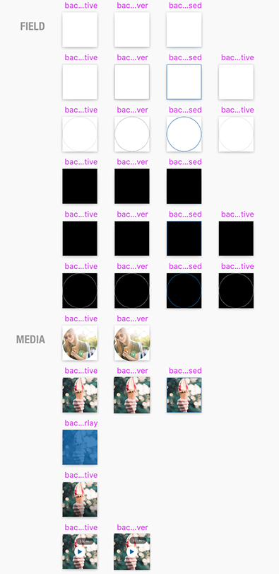
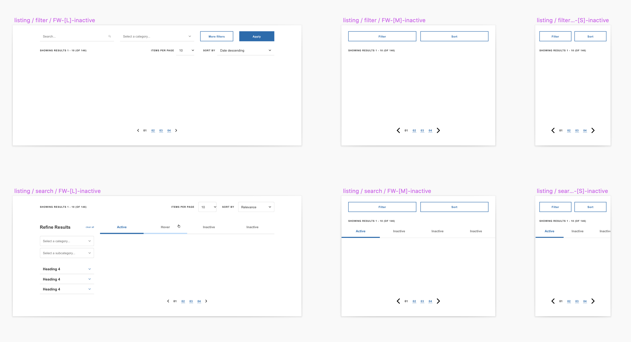
The form-field component consists out of multiple segments, one of which is the field molecule segment. This segment consists out of a combination of multiple symbol and rectangles with layer styles applied. This allows the designer to control the appearance in greater detail, without the need to have a different symbol for each and every different possibility, which can increase exponentially for complex elements such as form fields.
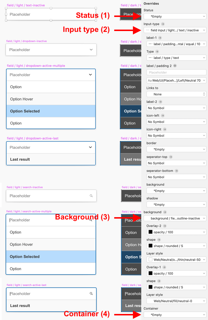
A field molecule segment consist out of combination of layers and symbols. For example, the input could be inactive showing a placeholder text or active showing the input text (2), or the border could be inactive or in a focus or error state (3). I also noticed that when the field should be displayed as disabled, a disabled layer on top should apply to everything that’s underneath. Hence I placed an extra layer on top which could be set to a disabled layer style if necessary (1). Finally, I came across several use cases where the field required a shadow drop. So I placed a “container” at the bottom of it all that would allow for shadow layer styles to be applied (4).
See examples of different field input molecules below:
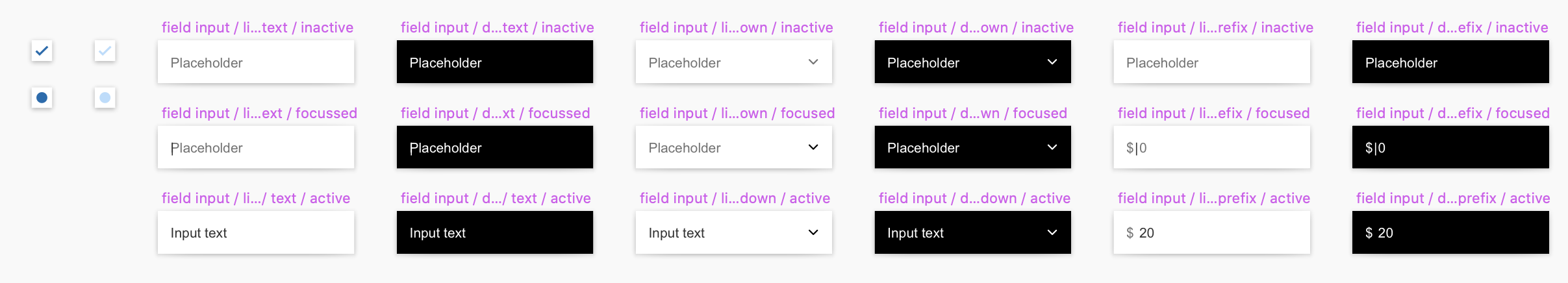
The input of the field molecule is also a molecule so that inputs can be easily swapped out for another input without disrupting the rest of the field.
5.4 Atoms
Atoms are the next step down in size from molecules and all fit inside a similarly sized square symbol (100px x 100px). They often contain items that have a combination of either a text character or an icon and some other shape, though it can also contain something that is slightly more complex than a flat icon.
Examples of atom segments are a loading spinner, a notification alert or a location pin that can be placed on a map.
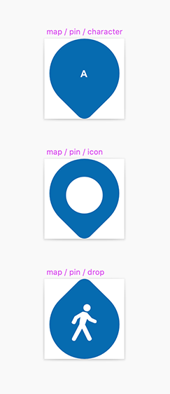
An example of an atom: a location pin that can be placed on a map. Atoms are the second smallest segment and are just like foundational elements technology agnostic, meaning that they can be used in emails, apps web etc.
5.5 Quarks
Quarks are the most elementary of all segments.
Divider
An horizontal line used to divide between sections. The divider is such an elementary segment because it can be present in other segments such as atoms, molecules and organisms; for example in between the rows in a side navigation menu.
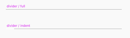
Two variations of divider quarks: one full width and one indented from the left.
Icon
The icon quark determines the different sizes an icon can have (S,M,L,XL) and how much padding is applied.
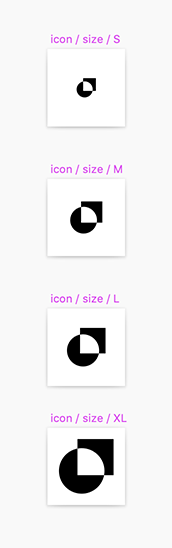
Standardised icon sizes S, M, L and XL.
Label
A label can be either text only, a text and an icon, or a logo. The label quark allows to choose between those three types and their possible variations. It also allows for adjusting horizontal padding.
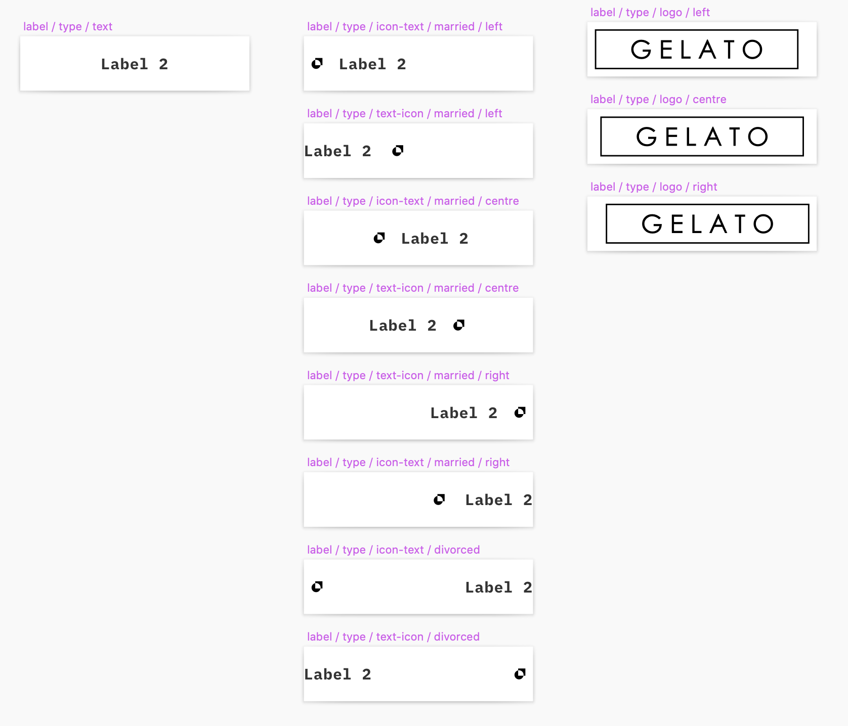
A label symbol can have 3 types: text, text + icon and a logo. One level above that sits a symbol that has different variations of padding so that the padding of each of these can be adjusted.
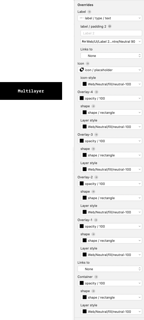
Multilayer
A rectangle with a layer style applied inside a symbol can be overridden with another layer style in the instance override settings. One of its shortcomings however is that you can’t change the shape nor the opacity of this rectangle in these override settings (in regards to the opacity, another layer style could be created with a decreased opacity but this would greatly increase the number of layer styles).
Overriding shape or opacity would be handy if for example you’d like an inserted button to have rounded corners instead of sharp corners (with a standardised ratio) or change the transparency of its background colour (with a standardised opacity amount).
To solve this I created two sets of symbols, one set of symbols containing rectangles (with a layer style applied) featuring various degrees of rounded corners (shapes, see below) and one set of symbols containing this rectangle symbol but then in slightly different opacity values (opacity, see below).
After stacking a couple of these opacity symbols on top of each other I’d have full control in overriding different shapes and transparencies and I’d have great flexibility in what I could alter on the instance level.
So in the button example, such a nested symbol enables me to add a transparent gradient hover effect plus a border on top all in the same shape as the background below that might be a pill or a rectangle, solely using the override settings.
To make this symbol even more flexible I added a link layer and an icon layer on top so it became a super general multipurpose symbol. I called it the multilayer.
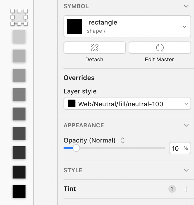
Opacity
To address the issue of not being able to reduce the opacity of a layer inside a symbol instance (as described above), I created 10 symbols each containing a shape symbol (see below) each set to a different opacity value. This allowed me to change opacities to standardised values inside symbol instances at will.
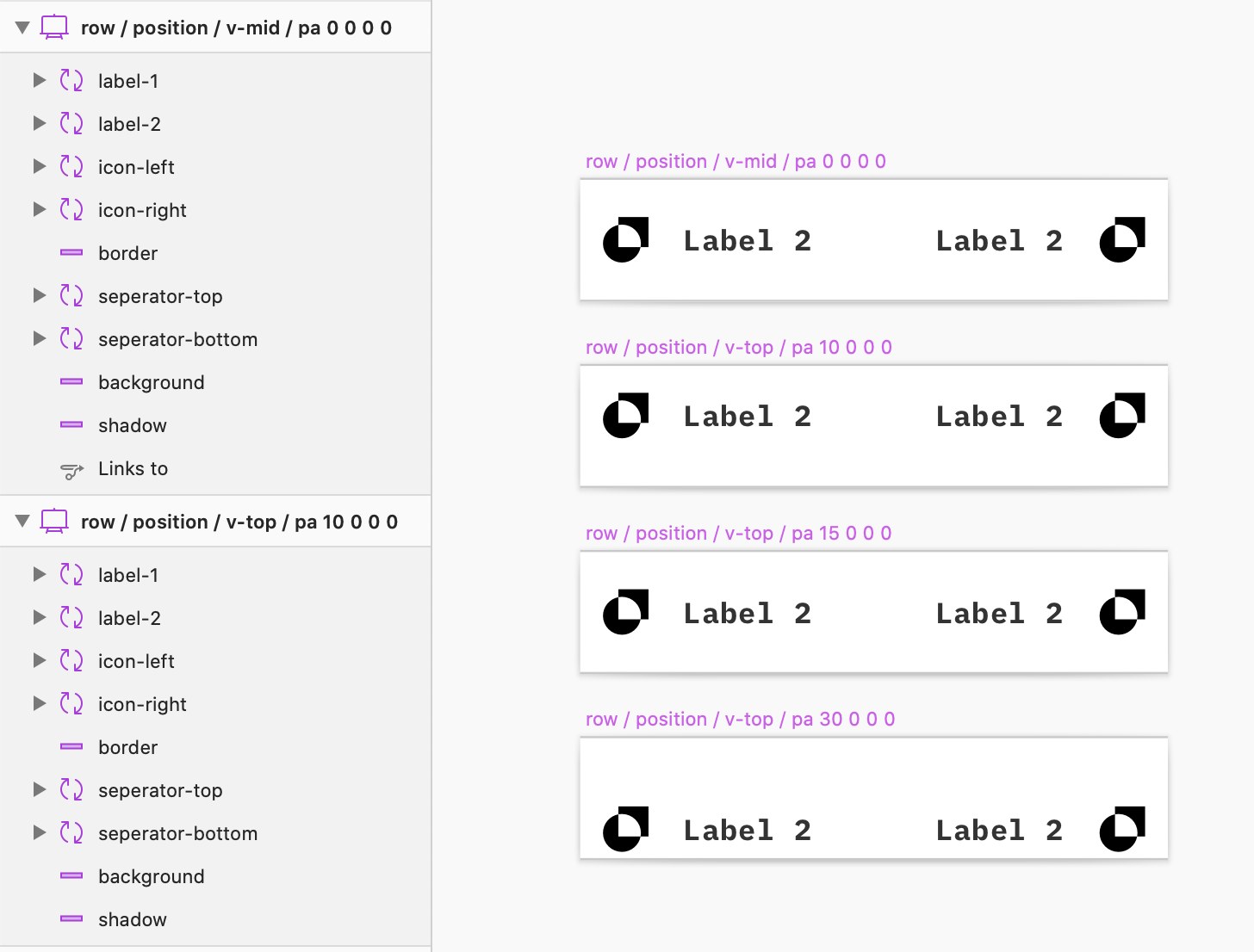
Row
A row is frequently used in places such as fields and navigation menus. It has text and/or an icon on the left and text and/or an icon the right and has multiple variations to cater for different positioning (such as top or centre vertical alignment).
Next steps..
This concludes the creation of the UI library, which enables us to easily call patterns in other designs and only need to create them once.
Next, we had to look at how to display all of these elements to developers and other stakeholders in an efficient way that makes sense.
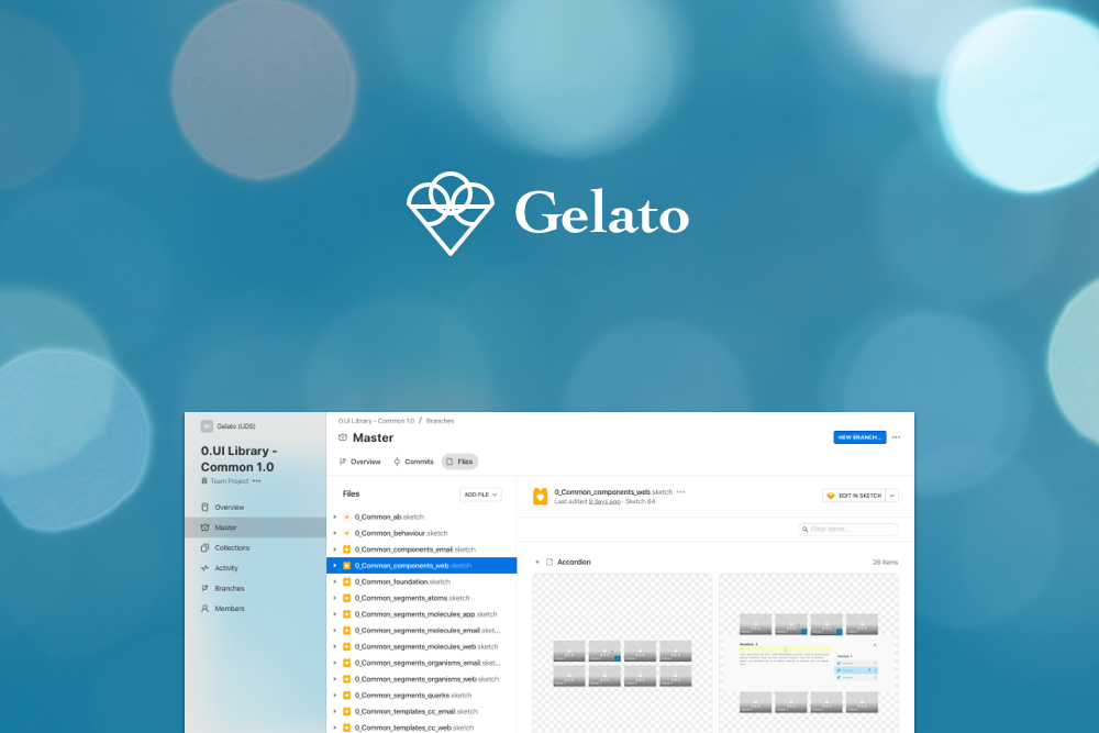
The "Vetrina"
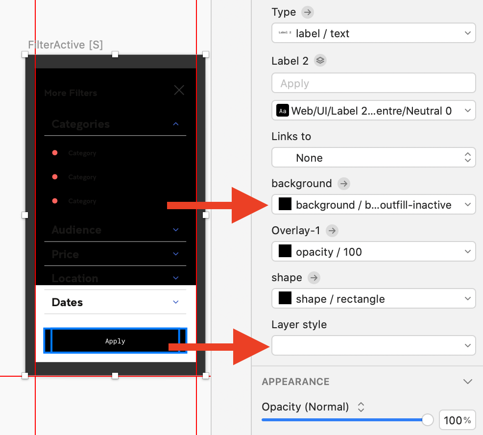
Each of the symbols inside the UI library has an individual page inside Abstract, where our designs are shared and stored. On these pages you can place comments and inspect the design in detail to discover specific measurements and find generated code. However, this method leaves very little room for providing any extra information apart from the design itself.
For example, sometimes there are multiple variations or states or additional annotation is required to explain how the component transitions from one state to another. Or there could be a panel that is normally hidden unless an “expand” button is pressed. A designer usually wouldn’t want this to be embedded into the master symbol when these designs are imported into other designs. In addition, each page has its own link and the amount of links increases significantly when each design element is shared around individually.
We solved this by creating a new project inside Abstract purely intended to showcase everything that lives inside the UI library and to explain how they work: the “Vetrina”. Vetrina is the Italian word for those Gelato counter top displays that you see in ice cream shops showcasing all the gelato. Instead of displaying gelato, it would showcase all the designs.
On so called “design boards”, inside the Vetrina, we placed all the individual parts that make up a full component or other type of design in low fidelity, high fidelity, different states and different breakpoints. On top of this, we could freely annotate anything that is necessary for a developer and it would have only one link (instead of many) that can be shared around.
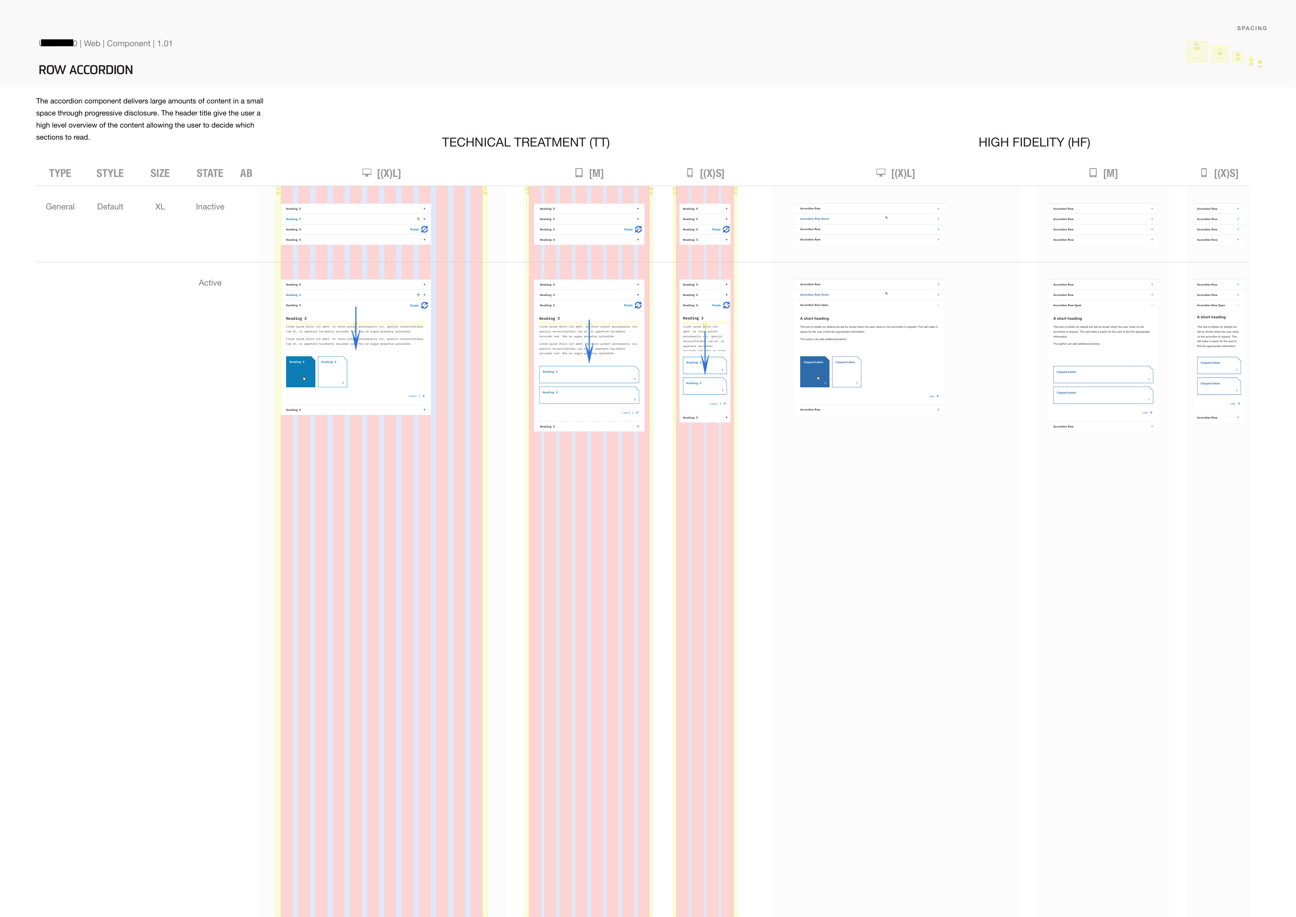
An example of a design board with an accordion component. All design boards follow the paper aspect ratio of 1 : √2 to make printing easier.
Certain patterns that are used in the annotation, such as on hover mouse pointers, arrows etc are also coming from its own UI library. We’ve name this the “utensili” or toolbox.
Final delivery to stakeholders and dev
In addition to these design boards, an animation demonstrating its actual workings could significantly increase its chances to be correctly developed first round. There should also be a design log that keeps track of every change.
An actual website that has all these in one place is ideal, such as those gel websites of big companies appear to do quite well. However, when this is not an option, an (internal) wiki (we are using Confluence) can do as well for the time being.
Finally, feedback should be gathered and implemented from various corners such as accessibility, usability, technical feasibility, brand, business owners and other stakeholders before it is ready to go to build. We are logging all of these in this same wiki space.
Plex and Final Product Designs
So far, we’ve only looked at how the Gelato UI library is structured but not yet at how the final product designs fit in. Also, working on design patterns in silo can be difficult; you’d need to have some insight into how it’d look and fit together in the real world.
Hence, I created an imaginary product design that combines many of the UI library’s design patterns into a fully clickable product prototype. It also sets the standard for how final product designs should be structured.
I called this imaginary product “plex”, a combination of “playground” and “example” which I subsequently placed on Invision for quick prototyping and sharing. Invision is a prototyping tool, but other prototyping tools such as Marvel would work just as well.
Sometimes a UI pattern contains content that is unique to that product but still repeats, such as a header or a footer, and thus each product actually also requires its own mini UI library.
So the final structure of a product has one mini library and then a Sketch document for each of the technologies that it has a design for:
- Productname-components.sketch (sketch library)
- Productname-web.sketch
- Productname-email.sketch
- Productname-app.sketch
- Etc.
Subsequently the appropriate UI library is linked through Abstract.
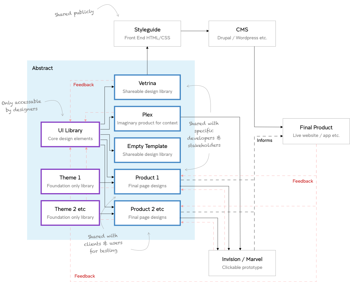
How it all fits together
All these different parts could be quite hard to wrap your head around. See a diagram below that puts it all together.
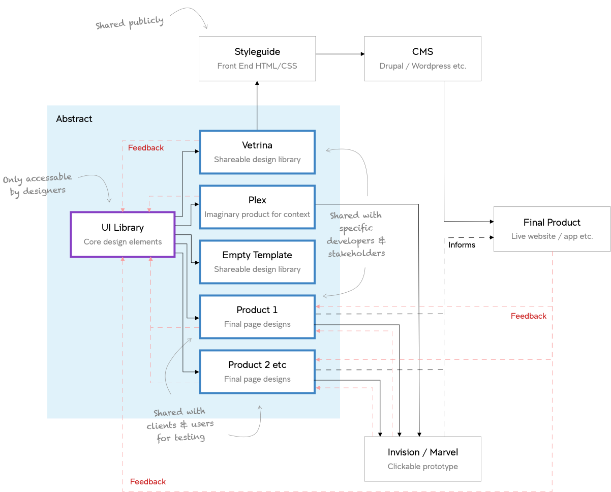
This diagram shows the different parts of the Gelato Design System. The UI Library sits at the root, informing the various “reader” sketch files: the Vetrina, Plex, Empty Template and the actual products. The feedback is recorded on a wiki page that keeps it all together.
Trouble in Paradise: The link between the library and sketch document breaks
Sketch files that are turned into libraries can be called upon by all other Sketch files when working offline. However, if you are using a versioning/collaboration tool such as Abstract, each Sketch library needs to be specifically linked to a project in order to gain access to this specific library. In case you have a lot of libraries and a lot of projects, there will be quite some linking effort involved. So it is better to keep the number of libraries to a minimum.
This is exactly why I’ve always tried to keep all patterns and their foundations in one library. If you never ran into any issues with this, I would advice to continue to keep it all in one library. If you did run into syncing issues however, keep reading.
The nightmare that is "Syncing Library Components..."
Having two versions of one component or template, one in low fidelity and one in high fidelity, had another advantage, in theory. Remember the requirement of having multiple themes inside the design system? Now I could create many more versions of the high fidelity symbol each with their own styling. All of these would still have the same “master” low fidelity symbol sitting right next to it. As with many ideas.. they sounded good at the time. In practice however, not quite.
So now I had hundreds of components and groups of components in one Skerch library, all consisting out of smaller and smaller symbols. When importing these into the designs, an insanely annoying bug frequently emerged in which the link between the library and reading document broke. A layer style couldn’t be called properly and would show as a black layer instead.
It seemed as Sketch was aware of this bug as they had a magical button designed specifically to address this. They called it: “Sync Library Components..”.
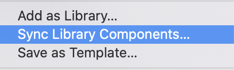
Activating this would go through all the library items and fix these broken layers one by one.
However, over time my library was becoming larger and larger and at one point becoming so large that the memory timed out and the computer would freeze before it could complete the syncing process.
So there you go, I was left with black blocks everywhere in my designs. They only way to “fix” it was to unattach everything, but that would defeat the purpose of all my hard work of nesting everything that was nestable.
I contacted Sketch about this issue, as it was preventing me to deliver designs to development. Their response was to split this one large library file into multiple smaller files. Made sense, so that’s what I did.
Breaking up
I created the smaller libraries by the types that I had started to define in the beginning:
- LibraryName_ foundation
- LibraryName_components_email
- LibraryName_components_web
- LibraryName_segments_atoms
- LibraryName_segments_molecules_email
- LibraryName_segments_molecules_web
- LibraryName_segments_organisms_email
- LibraryName_segments_organisms_web
- LibraryName_segments_quarks
- LibraryName_templates_cc_web
- LibraryName_templates_cc_email
- LibraryName_templates_pages_web
- LibraryName_templates_pages_email
It seriously took a while to re-link all the connections but the plugins Symbol Instance Locator and Symbol Swapper by Sonburn were of great help.
After everything was finally linked up correctly, it turned out it had made no difference. I still couldn’t sync up before the computer would run out of memory.
Removing the "themed" symbols (nested symbols with styling changes)
It seemed as if I had hit a dead end until I stumbled upon the Camilo plugin. Camilo automatically replaces selected libraries inside nested symbols. This meant that I could insert a component but choose to replace it’s foundational library with another foundational file. Tada, it would keep it’s structure but it’s styling would be replaced.
This meant that I could delete all those components that had a nested symbol only to have its styling changed and clear up so much memory space. It also reduced so much work of swapping all these nested symbols for a higher fidelity version.
After discovering that a plugin called Camilo could replace all foundational items with a couple of clicks there was no need for themed versions of components, clusters and page templates anymore. These themed symbols had extremely large nested symbols, which in turn added up to ridiculous loading times.
The Final Design System
To conclude, since I had split out the one big library into smaller libraries, one great advantage arose. The foundation library had now become its own library too, which could be swapped for another foundational library using the Camilo plugin and I’ve never looked back.
See the final structure in the diagram below.
The final structure of the Gelato Design System. The UI Library is still located at the root, feeding the various “reader” sketch files but it’s foundational file (as it has been split) can now be replaced by another foundational file emulating themes.
Update: Since this post was published the diagram of the full framework has come a long way, view the latest version of this below:
A Final Thought...
One thing that I’ve learned from all this, is that designing this way can be very time consuming. To change something that is deeply nested inside a component or page template you’d need to open inside library inside library inside library and so on. Subsequently, you’d have to save upon save upon save upon save to see its effect.
This turned out to be so time consuming that for the latest Gelato iteration for the university I abandoned placing components, component clusters and page templates inside symbols completely. This time, I designed them flat “on the fly” on Vetrina design boards and kept only the foundation and segment libraries intact.
Originally the plan was to design them all on the fly first before still placing each of them inside symbols later. However, now I’m in doubt whether I should abandon this practice all together. If developers develop the components in a timely manner, future authors and designers should just be able to work with the real thing?
Even though this might be true in theory, there might still be future designs that contain a mix of new and existing components, then it could be very useful to quickly insert an exiting component symbol.
I guess I shall find out.. but until then, what do you think? Please share in the comments below or if you have any other questions, suggestions etc please share too!:)


2 Comments