The best way to find out whether your designs are actually working for your users, is to let real people use them and carefully observe how they navigate through. The trick is to let users hear their thoughts out loud so that we can hear immediately what is bothering them or what is going well.
The first step is to prepare a list of user scenarios based on high value user stories. From the scenario, specific tasks can be derived that we ask the user on the day of testing.
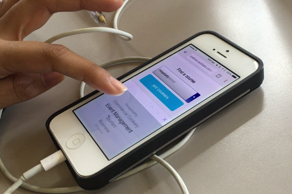
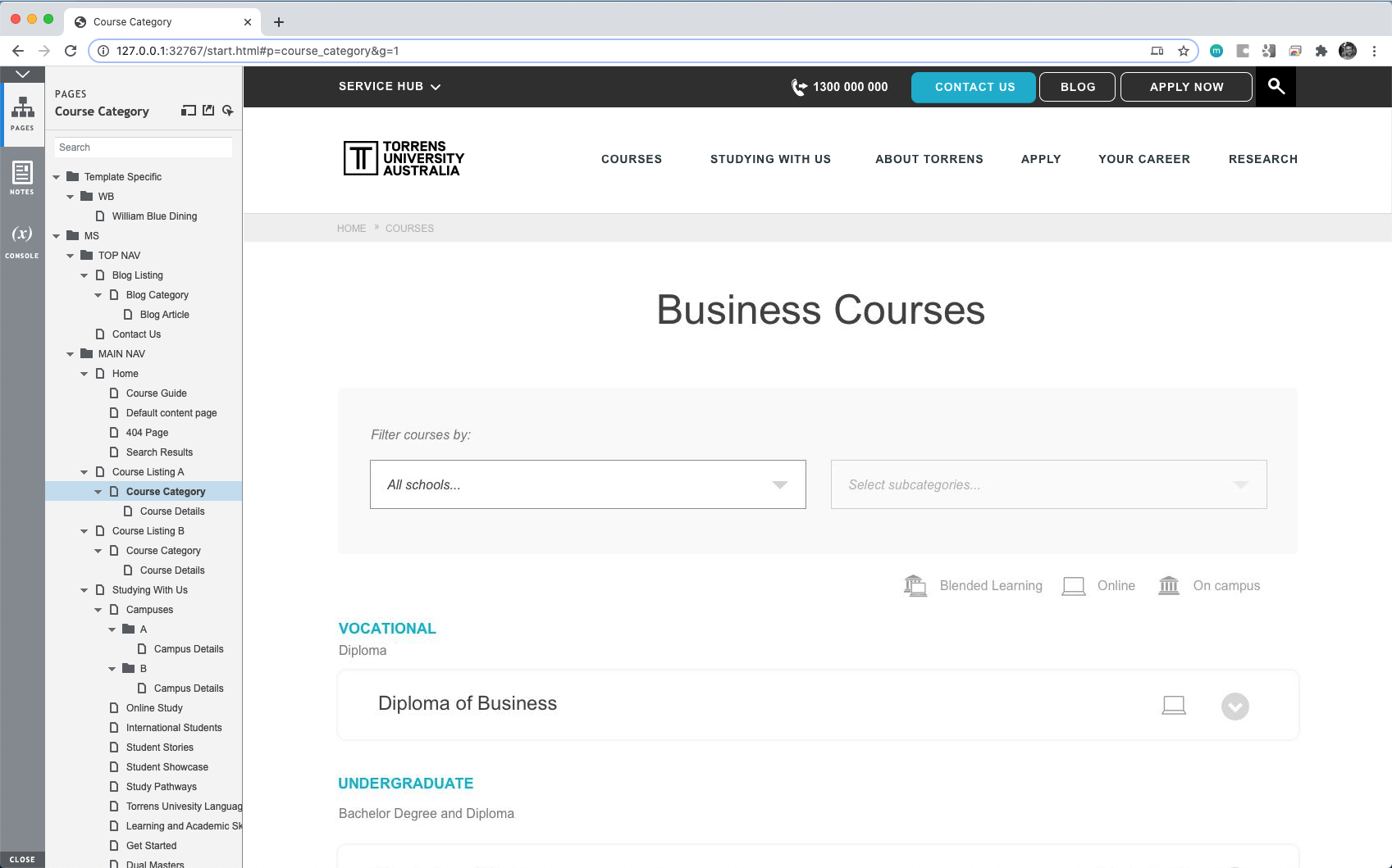
For example, a high value user story could be “As a recent graduate, I want to know what courses are available in my field of interest so that I can find a course that I would like to study”. The scenario could be “A recent high school graduate goes to the multisite website to find out what courses are available in the field of business”. The task that we ask the usability participant would be: “Imagine you recently finished high school and you want to study business, but you’re not sure which course you want to study. Find out what business courses are available.”
After we have a list of tasks compiled, we make sure all possible screens that allow for these tasks to be completed are designed in a low fidelity wireframe in Axure, a digital paper prototyping tool.
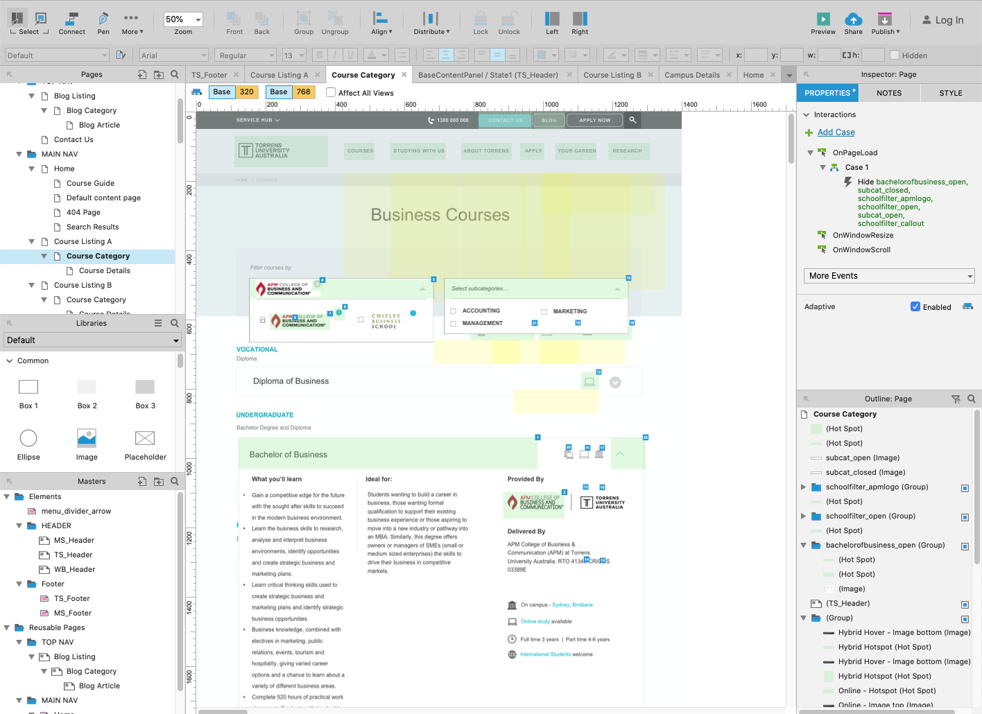
When the prototype has been constructed, it can be loaded into the browser as if it were a real website.
After both the list of tasks and the accompanying prototype have been created, we check what the quickest way is to get those tasks completed. Then we can move on to see how our users will go about it.
Sometimes finding user can be a bit tricky, but luckily in our case we were surrounded by users when we setup shop at any of the open days at any of the colleges. All we had to do was bring our laptops and chocolate.
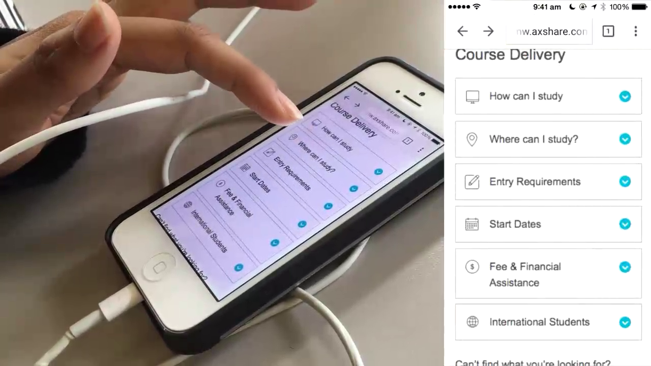
To make sure we received as much feedback as possible, we asked the participants the task questions ourselves and kept reminding them to think out loud. In addition, we filmed their hand movements (when on mobile) and recorded the screen at the same time. We later edited these two videos together side by side.
After we asked them to perform the task, we counted how many steps it took for them to complete these tasks and we compared it against the quickest way that we calculated earlier. We also recorded the duration. If the amount of steps is the same as the quickest path that we recorded, and within a reasonable amount of time, we counted the task as success. If people struggled to complete the task or if it took a really long time, then we counted it as a “need improvement”.
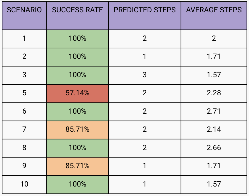
Then were plenty of learnings we could take from how they actually navigated and whether it was different from that we expected. Maybe it was the same number of steps, just different steps. Also their feedback on everything they did was highly valuable.
We placed this and the table inside a report that we eventually presented and used for further design amendments.
Google has developed a usability framework called the HEART framework, that aims to add more metrics for testing than solely task performance. In addition to the T for task, the remaining letters stand for Happiness, Engagement, Adoption and Retention. Future usability templates that I have developed have these additional metrics embedded in the questioning from the get go.