
While building my first enterprise design system for a large university in 2019, I also had to define the accompanying design language. A key part of this was developing a colour palette that respected the university’s brand colours while remaining flexible enough to support the full range of shades a scalable design system requires.
At the time, I came across a method for visualising colour using a Saturation–Brightness (often called Saturation–Value) square. For each hue (0–360°), this model plots the most saturated version of the colour on the right, and the brightest version along the top. Brightness (or value) can be understood as how intense the light is—at zero it is black—while saturation describes how much colour is present. At zero saturation, a colour contains no hue at all and becomes a shade of grey (or white when brightness is at its maximum).
In practice, different UI elements require different combinations of brightness and saturation. A call-to-action (CTA) button might need a highly saturated colour to stand out, while backgrounds or secondary surfaces typically benefit from lower saturation for a softer, calmer feel. On top of that, interaction states such as hover, focus, and pressed states all require carefully related colour variants. As a result, most mature design systems define around ten shades per colour, giving designers enough flexibility while staying on brand.
While building such a palette, a major challenge emerged: determining which colour combinations would still allow for legible text. Text legibility is defined by WCAG, the web’s widely adopted accessibility standard. Under WCAG 2.x, normal-sized text must meet a contrast ratio of at least 4.5:1 to be considered accessible at level AA (large text requires 3:1). Manually checking contrast ratios for every possible colour combination quickly became a slow and tedious process.
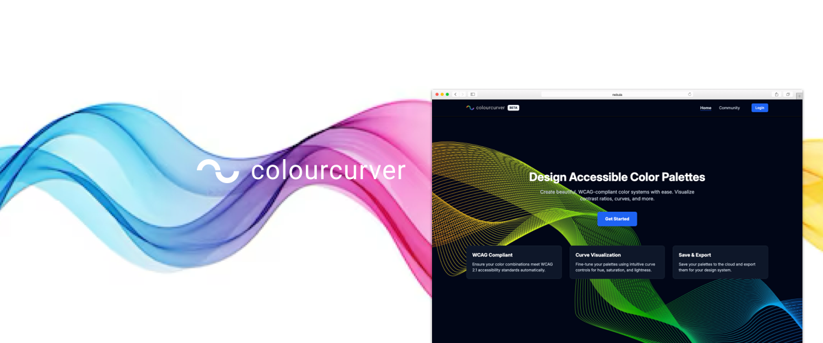
That friction highlighted a clear opportunity for a better tool—one that could make colour exploration and accessibility constraints visible at the same time. Out of that need, Colour Curver was born.