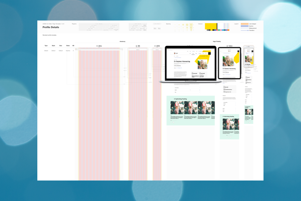
I originally created Design Boards to streamline designing within a GEL and to easily convey all information that developers and other stakeholders might need. See my first post on how this came to be and what my first first design boards looked like.
As time went on I discovered that there were a couple of improvements I could make that made designing on these boards even better.
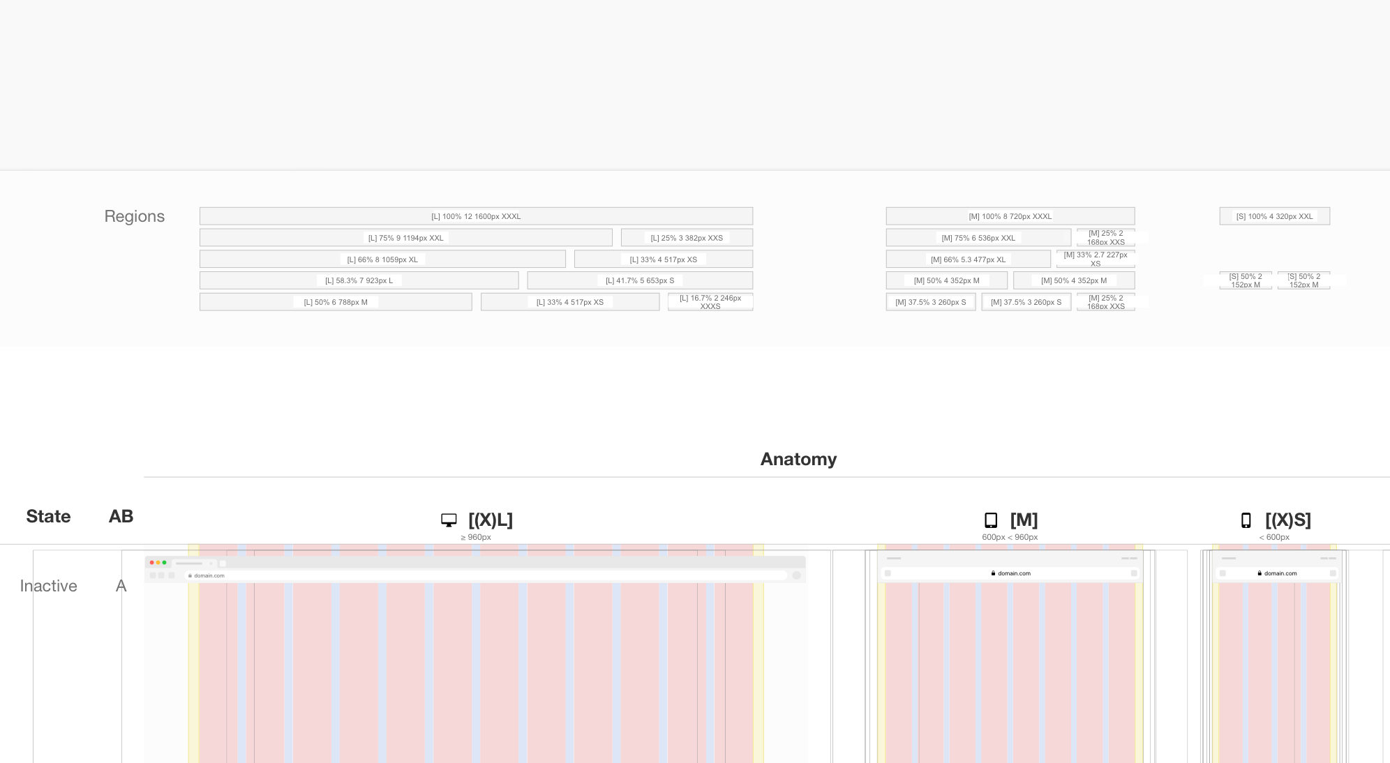
Regions
The possible regions which can hold components are now aligned with the layout in the “Anatomy” section which was previously known as “Technical Treatment TT”. This is easier on the eye and it is quicker to see which component could have which size in the Gelato 3.0 Design System. The regions it itself have clearer labels now in case you’d like to overlay these on top of something else to indicate which size it is.
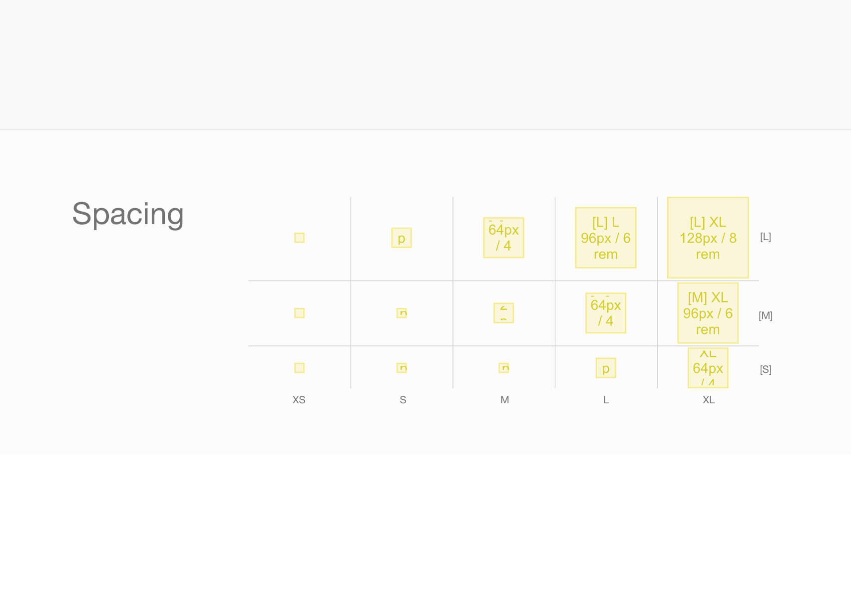
Spacing legend
I’ve added a tiny axis to the spacers so that it is easier to see what sizes they are intended for and for which devices. These can be large devices [L] such as desktops and laptops, medium devices [M] such as tablets and small devices [S] such as phones.
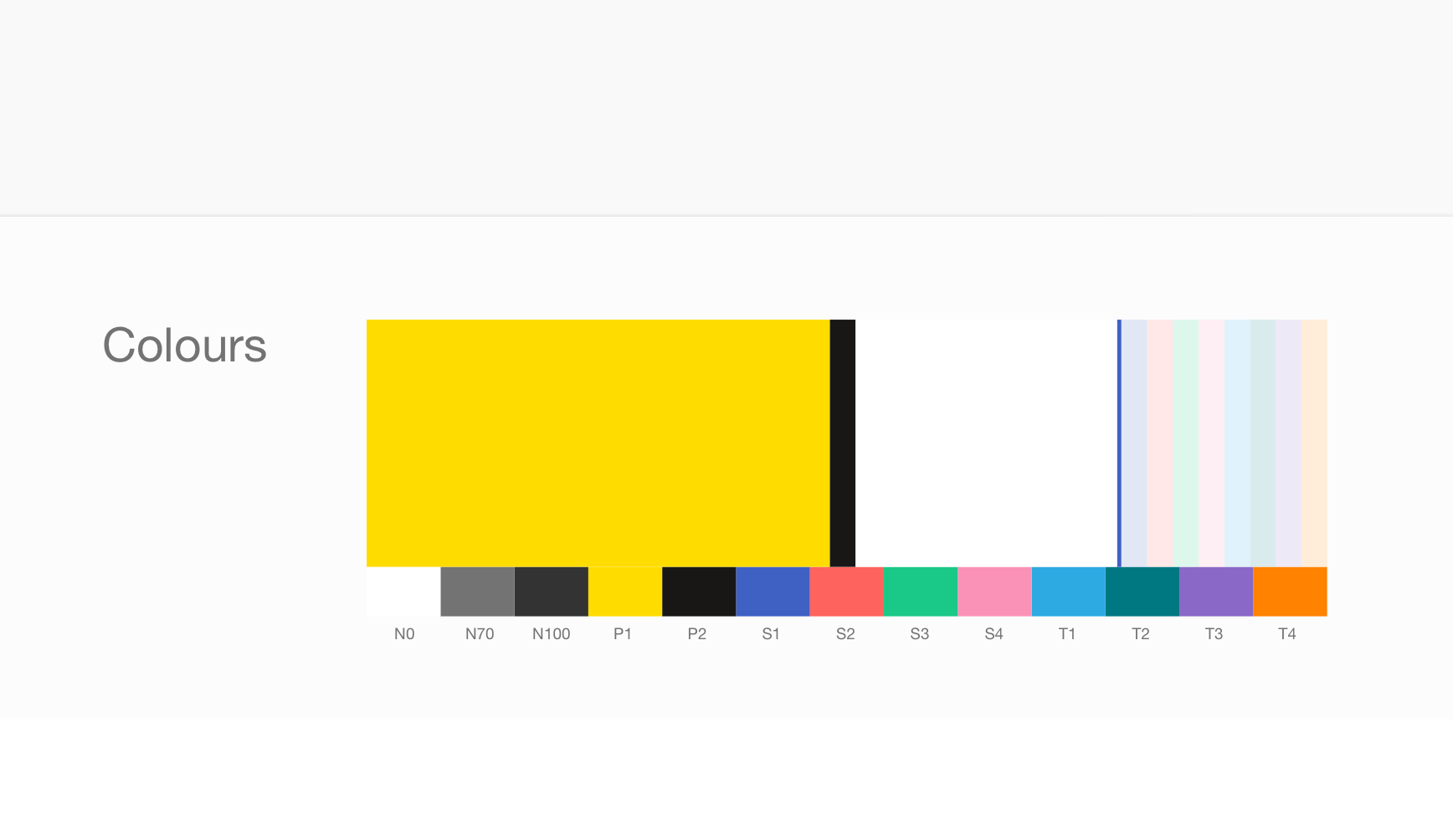
Colour Balance
The colour balance indicates the proportion of colours that should be used on different page types. This is currently set as the balance for landing pages, but as it is a symbol it could be replaced with colour scales of other page types too. Using the colour balance of a landing page as an example, you can see that lots of yellow should be used, a tiny bit of cod grey (mainly for the text), plenty of white, a tiny bit of indigo (mainly for links) and finally pastels can be used which are all of equal weighting.
Device Sizes
In addition to adding low fidelity browser mockups on template design boards, I’ve added thin lines that indicate the screen size of different devices. This will help knowing what could fit “above the fold” for a number of devices when designing a page.
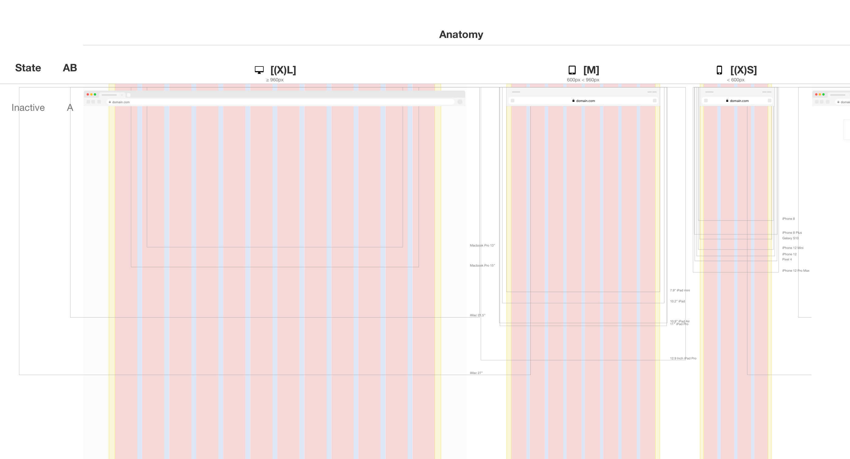
Device Bezels
Over the years I had built my own tiny library of device bezels but it was always messy and inconsistent. Having such a library can be useful to see what a design would look like on different devices.
Then I stumbled upon Devices by Facebook Design, a large Sketch library created by Facebook solely focussed on raw designs of devices and all consistently crafted. All I had to do was replace the screens with an actually screen symbol that has an an image style applied inside. This would help me to (1) replace it with another symbol or (2) assign another image to the image style. This way it would be easy to swap the screen for something else and make it appear as if it displayed on the device.
Then I realised that if I actually kept inserting the screen frames as “difference” while blended with the solid panels below, I could turn all of these devices into bezels. This leads to the ability to emulate entire page designs as if they were displayed on the actual devices.
Overview, Developer, Usage and Accessibility
I noticed that the design board alone was often not comprehensive enough to explain the workings of a component to all the developers and stakeholders. Ideally yes, each component design should be accompanied by an animation that demonstrates how it is supposed to look. However, the reality is that animating takes a lot of time, which I often didn’t have in my one man design team.
So I started exploring how the component designs could be displayed clearer to a wider range of stakeholders and I commenced the creation of new pages called “Overview”, “Usage” and “Accessibility”. The design board page, previously known as “Web”, was now renamed to “Developer”.
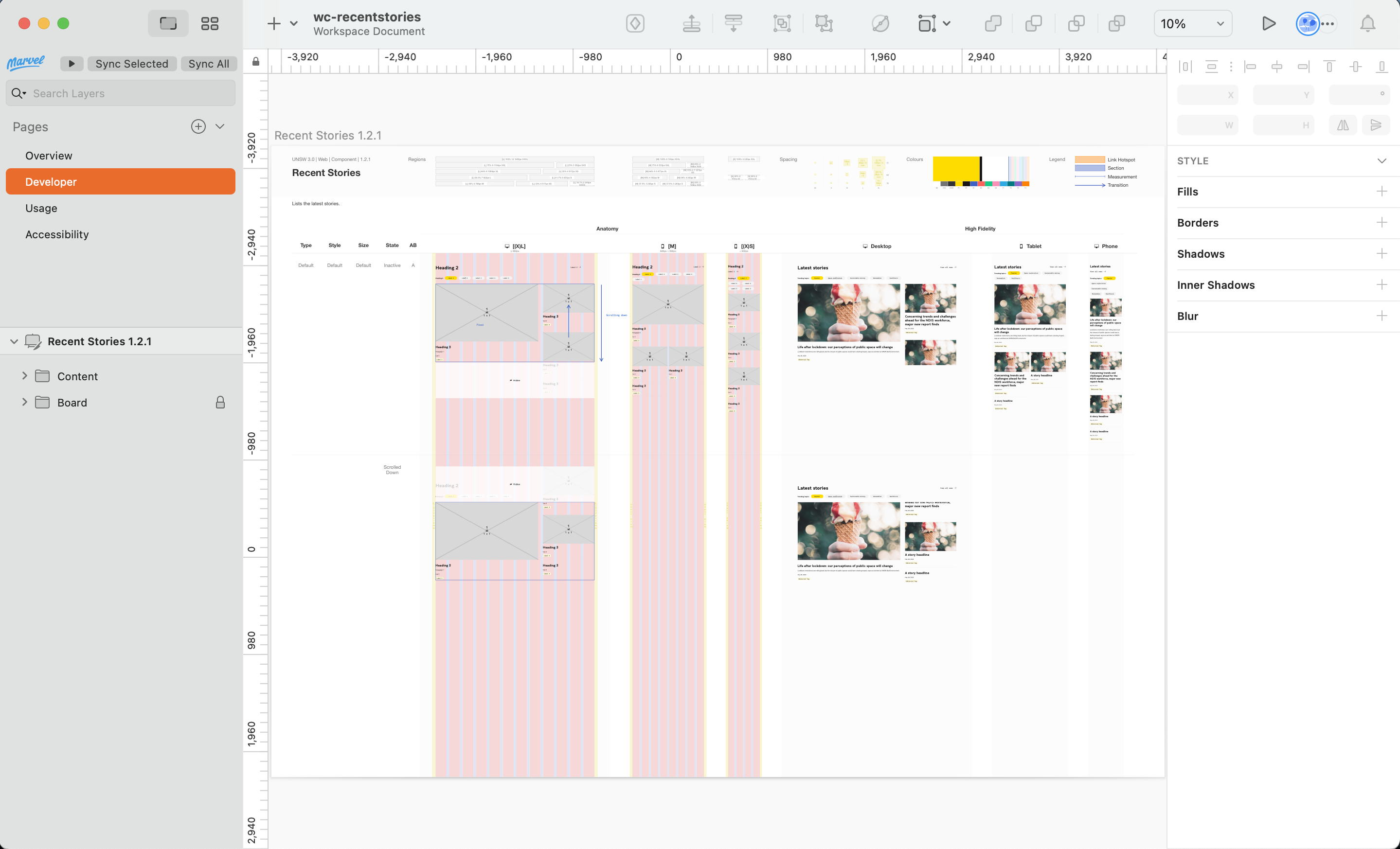
- “Overview” contains a desktop version of the component meant as a quick overview of what the component looks like
- “Developer” contains the design board as we know it
- “Usage” contains the do’s and don’ts, variations, placements, sizes and responsive behaviour
- “Accessibility” emulates how the component looks like for different visual impairments
I’ll go into all these individually a little deeper in a later post (Part 3).


